Creating advanced charts with the Charts tool
The Charts tool allows you to visualize multiple datasets on a single, customized chart. Charts is more flexible than the Analyze tab, since you're not limited to one dataset. You can combine different sources from your domain and the entire Opendatasoft network. Then, after you create and save a chart, you can share it, embed it, or use it as a widget.
To use Charts, go to any ODS portal and find it through the portal's navigation (on your own portal this is the Charts tab at the top of the page). Otherwise, you can type /chart at the end of any portal's URL.
Your first layer
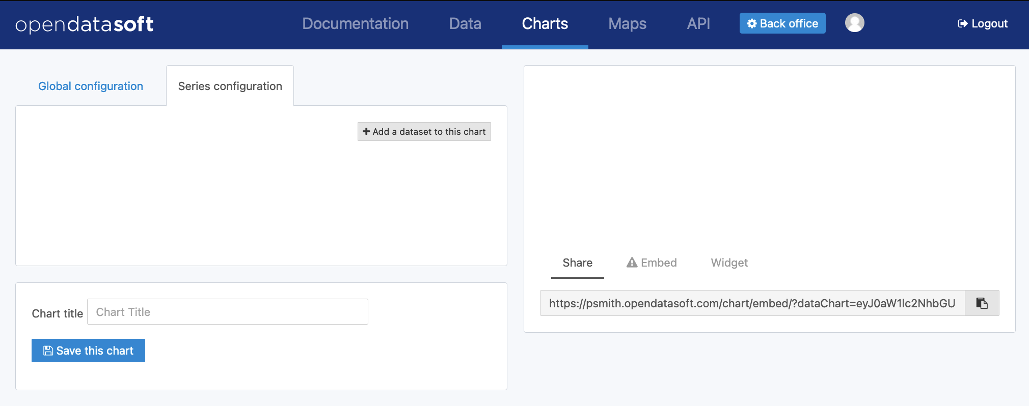
Click on Add a dataset to this layer to start importing data to your chart.
The list of available datasets is displayed. You can search or browse by category to find the dataset that interests you, then preview and filter it before importing it.
As an example, let's take the public dataset "Entreprises immatriculées en 2015" from the Data Infogreffe domain. You could click Filter data to refine the data, but in our case let's select the dataset.
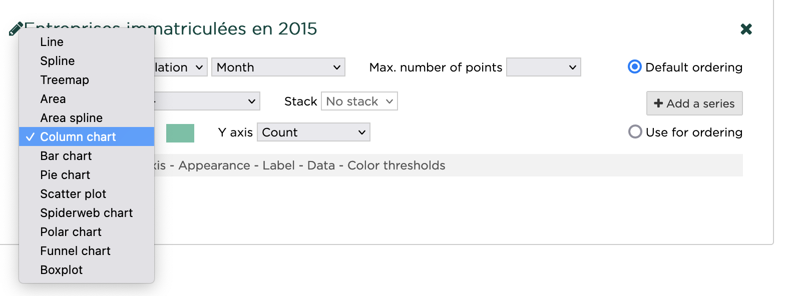
In the configuration, you can choose the appropriate type of graph. Select Column chart.
By default, Y-axis is set to Count. Next to this selection menu, you click on the color box to pick another color for the columns.
In the configuration settings, click on Appearance, then display values on chart. This adds a label with a numerical value on top of each column. Under Y-Axis, you can set the scientific display for the Y scale.
Finally, click on Color thresholds and add a threshold. You can add multiple thresholds with different colors, but here is what this layer looks like with a threshold for all values above 10,000.
Adding a series
You can add a data representation on the same dataset by clicking on Add a series and adding the same dataset.
The X-Axis parameters will be the same, but you can customize the type of chart and tweak the appearance on the new series.
Try changing the type from Line to Spline to see a smooth line on top of the initial column chart.
You can reorder the series by clicking and dragging on the icon to the left of the chart type. The series order affects the chart legend, and the series at the top has priority on the Y-Axis parameter.
Creating a chart with multiple layers
You can create data visualizations with multiple, different layers. Such visualizations can help you find trends in data.
For example, you can create a data visualization to find whether oil prices are correlated with gold prices. This example relies on the monthly prices of Brent and West Texas Intermediate (WTI) oil from 1988 to 2019, and the monthly price of gold from 1988 to 2019 as reported by the Deutsche Bundesbank.
Step 1: Add your first layer
Go to Charts
Click on Add a dataset to this layer
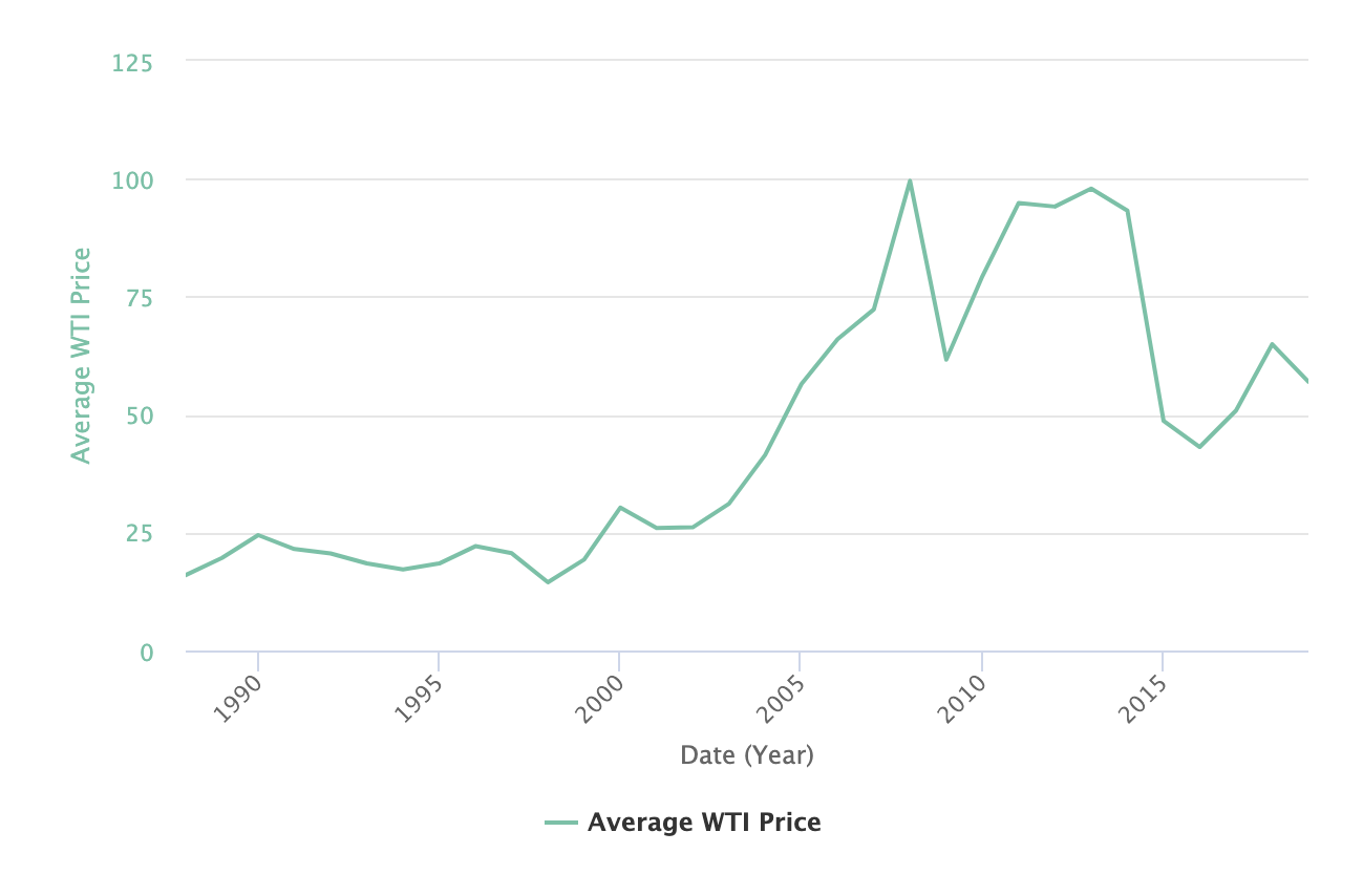
Search for "oil prices" and select the "oil prices" dataset
A line has been added to the chart.
Step 2: Add a series
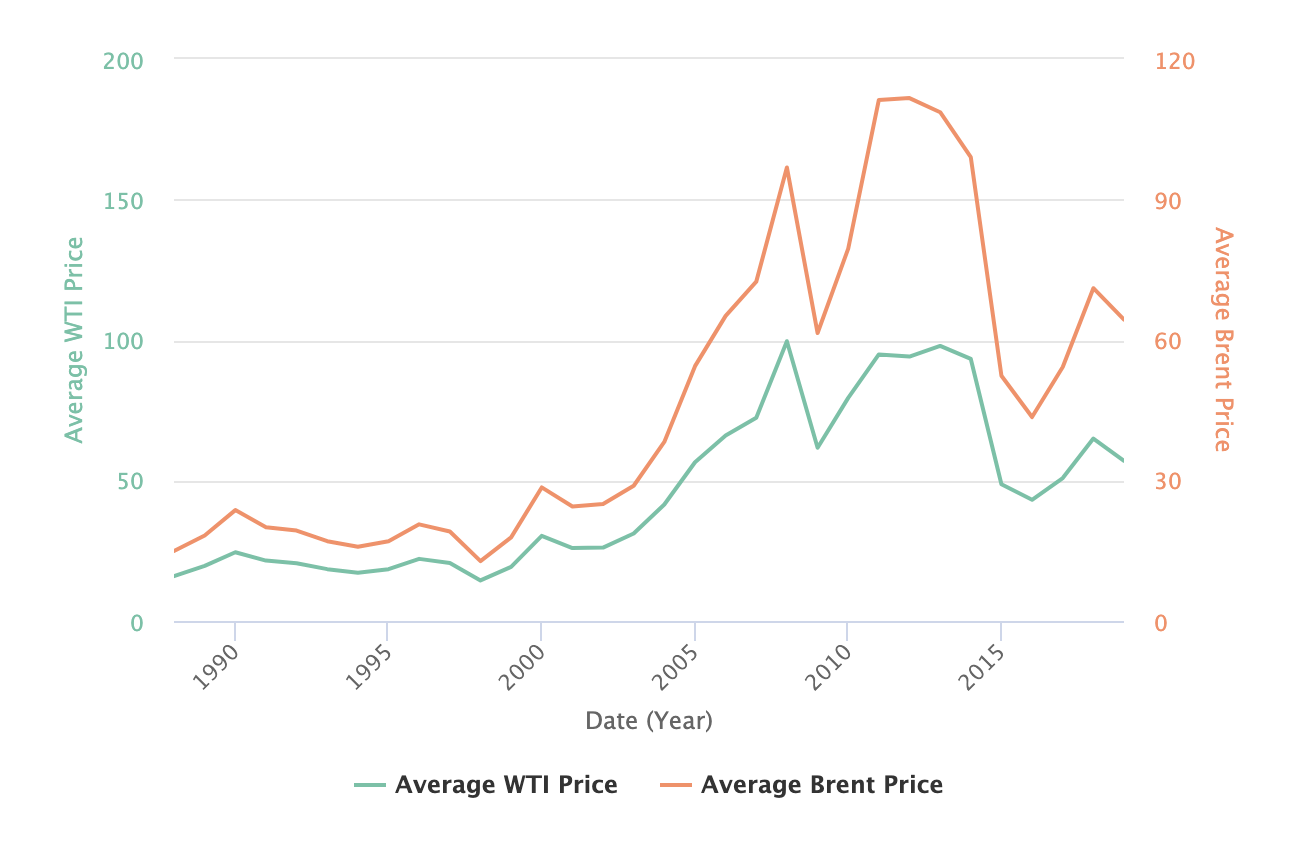
Add another series to show Brent prices:
Click on Add a series
On the line that appears, change WTI Price to Brent Price and leave the other parameters unchanged.
A second line has been added to the chart.
Step 3: Add another layer
Add the gold price dataset to see whether there is a correlation between oil prices and gold prices:
Click on Add a dataset to this layer
Search for "gold prices" and select that dataset
The default visualization is a line with the average gold price.
You can click on the pencil icon of a layer to change the selected dataset or refine the query.
On the gold price layer, click Configuration > Label
Enter "Average Gold Price" in the Alternate series title field
Step 4: Finalize the chart configuration
Add a title to the chart.
Enter a name for this chart in the Chart title field.
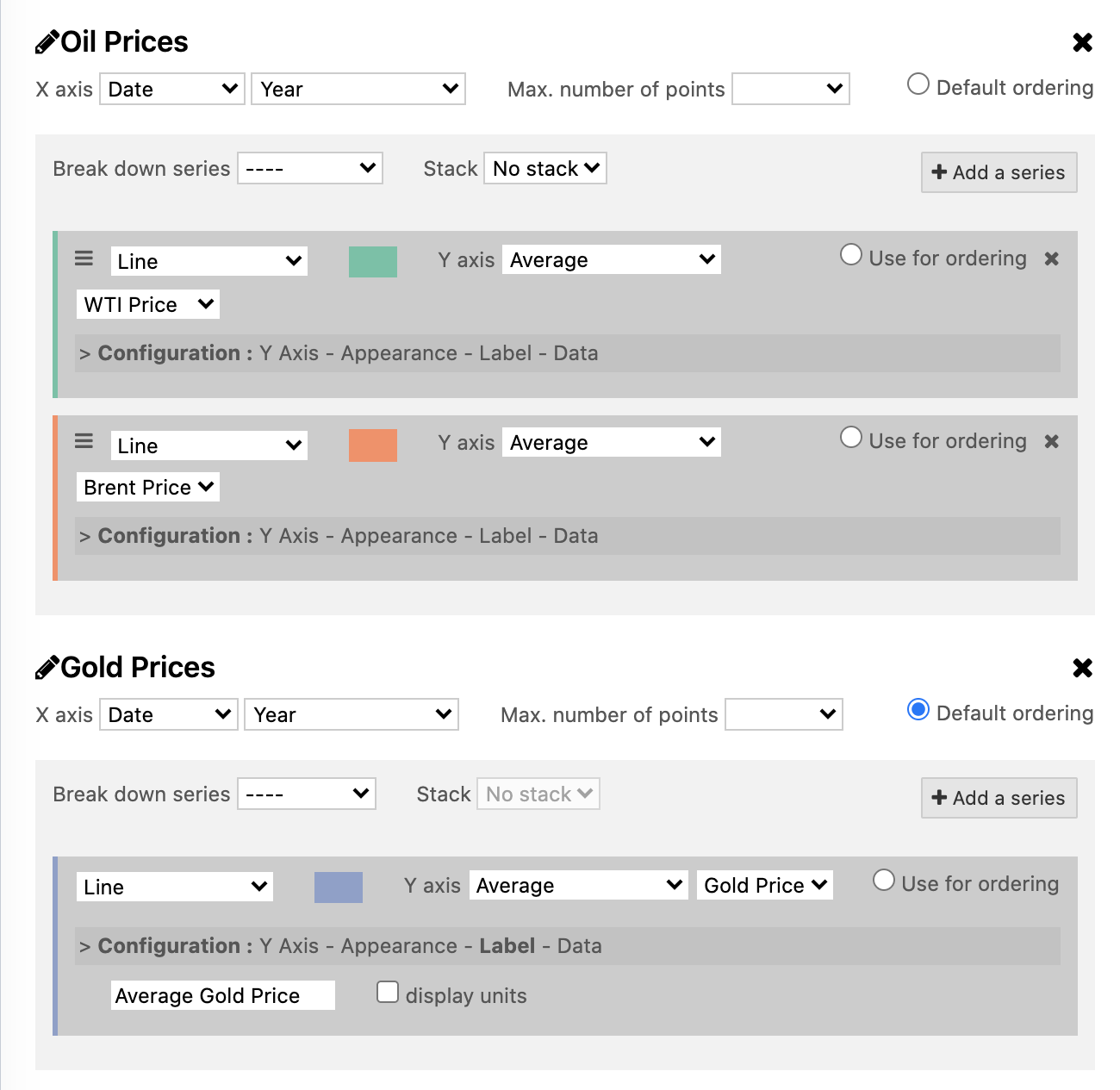
Here is the final configuration:
Click on the Save this chart button to create a short URL that you can embed or share.
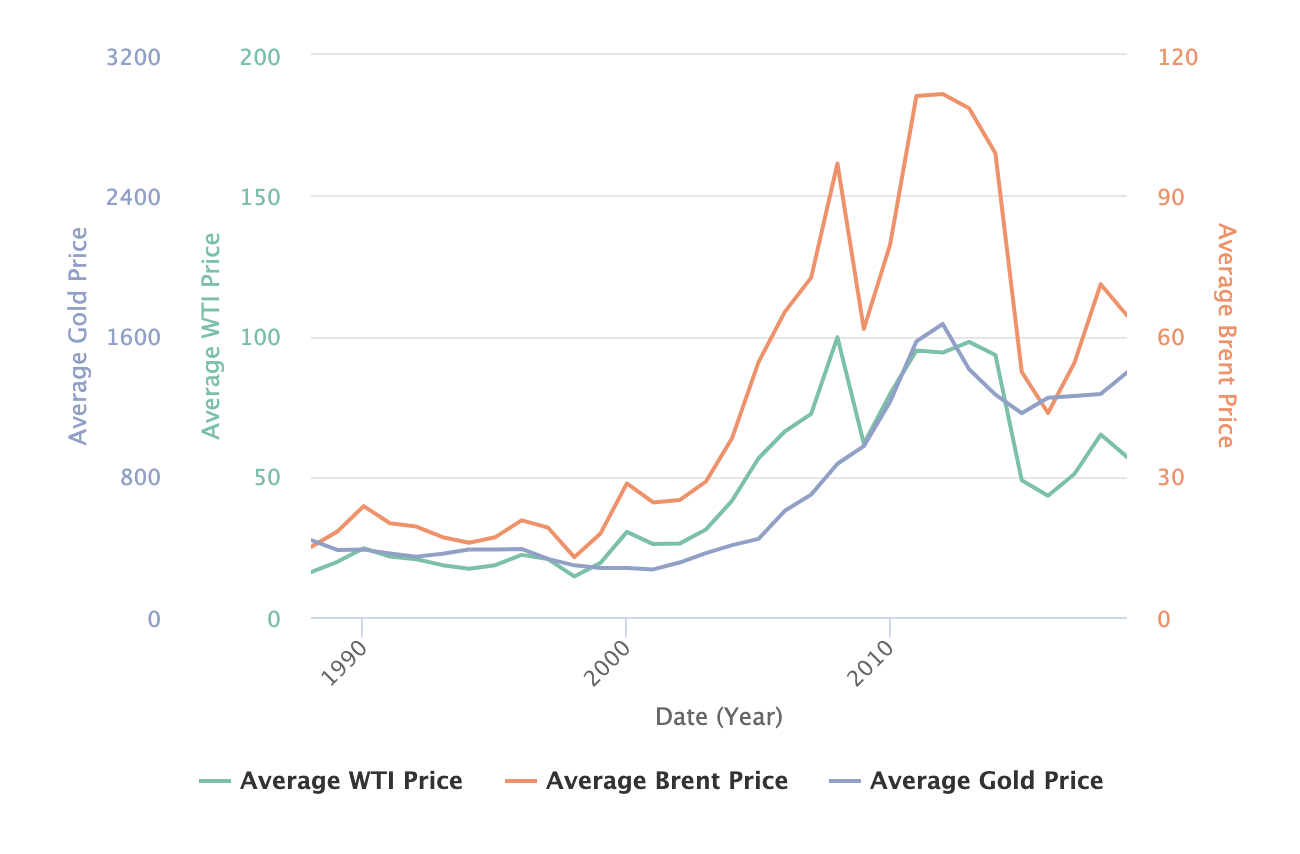
Here is the final result of the chart:

