
Adding a chart in Studio
In Studio, you can use charts to create a graphic representation of your data.
Step 1: Select the block type
You need to define the block type before you configure the content you want to add.
From the preview pane, click the block you want to edit.
From the left side pane, select Chart as the block type.
Click Next.
If you change your mind, you can always change the block type afterward, but note that the block configuration will be reset after you change the block type.
Step 2: Select the dataset
Select the source dataset to create a graphic representation of the data.
The dataset is only selected for the current block. If you add some content to another block afterward, you will need to select an input dataset again.
From the left side pane, select the desired dataset from the list.
A preview of the first 20 records opens in the preview pane.
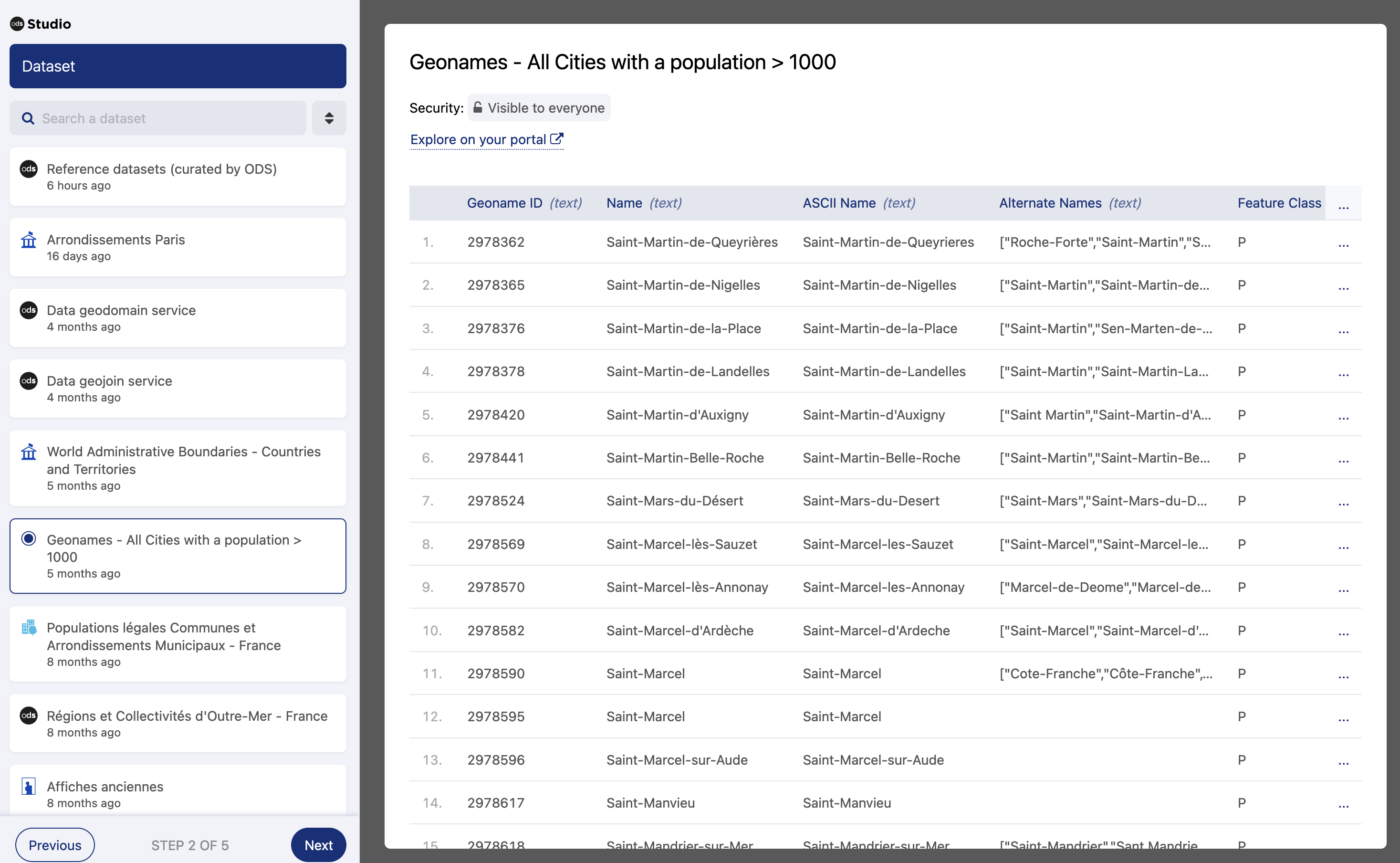
Click Next to continue with the configuration.
Step 3: Select the visualization type
After selecting a block type and the input dataset, you can now select the type of chart to be inserted into the block.
From the left side pane, select the desired type of chart.
Click Next to continue with the configuration.
Step 4: Configure the visualization parameters
From the left side pane, choose between a single and a multiple series chart. A multi-series chart can host up to five series at the same time.
Configure the data your chart will display:
Note that the name of the field you need to configure (vertical axis, horizontal axis, sectors, categories, or values) will change according to the kind of chart you have chosen to build. The available fields can be one of three different kinds (names, dates, or numbers), indicated on the left of each field by a small icon.

If you are creating a multi-series chart, this will be the field common to all of the series.
For single series charts, the second section name will also vary from chart to chart, but this section is used to compute the data in your chart. Select the function and field you wish to use.
In the case of multi-series charts, the second section will have a tab for each series. You can add a new series by clicking the + button, and delete series by clicking the trash icon in the series tab.
Each series has its own function, dataset field, and conditions, to be set independently from the other series.
(optional) You can also refine the data shown on the chart:
Under the second section, click Add a condition.
Select the field from the input dataset.
Select an operator. Depending on the field type, the available operators may vary.
Click Confirm.
For more information, see Refining data.
(optional) To configure the number of results to be displayed, toggle on Limit the number of results to display and enter the number of results to be displayed. This option is currently unavailable for multi-series charts.
(optional) For multi-series charts, to change the way they are plotted, select Separate, Stacked or Percentage under "Series parameters."
(optional) To configure how results are sorted, select the axis to use first if using a single series, and select in what direction you wish to order. The options will vary according to the axis you chose (descending or ascending order, A->Z or Z->A).
Click Next to continue with the configuration.
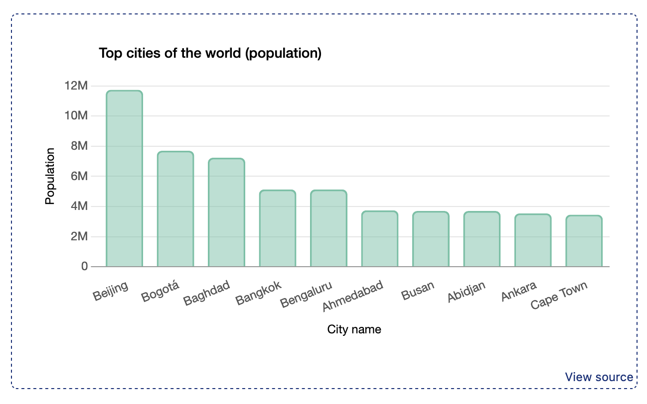
Step 5: Configure the visualization styles
Studio includes several predefined layouts. A default layout is selected to help you through the chart setting.
Change the layout by clicking on Information layout and selecting a different one.
Enter the required details in the corresponding fields (the chart title or subtitle, and the axis labels). These details are critical to your chart's readability, and are mandatory. They are also used by screenreader software for accessibility purposes.
For multi-series charts, you are able to customize the color and legend for each series. Note that Studio provides a default palette of colors, but you can customize which colors are available in look&feel/datavisualizations in your backoffice.
Click Finish.
At this point, on the left you will see a summary of the parameters you just configured.
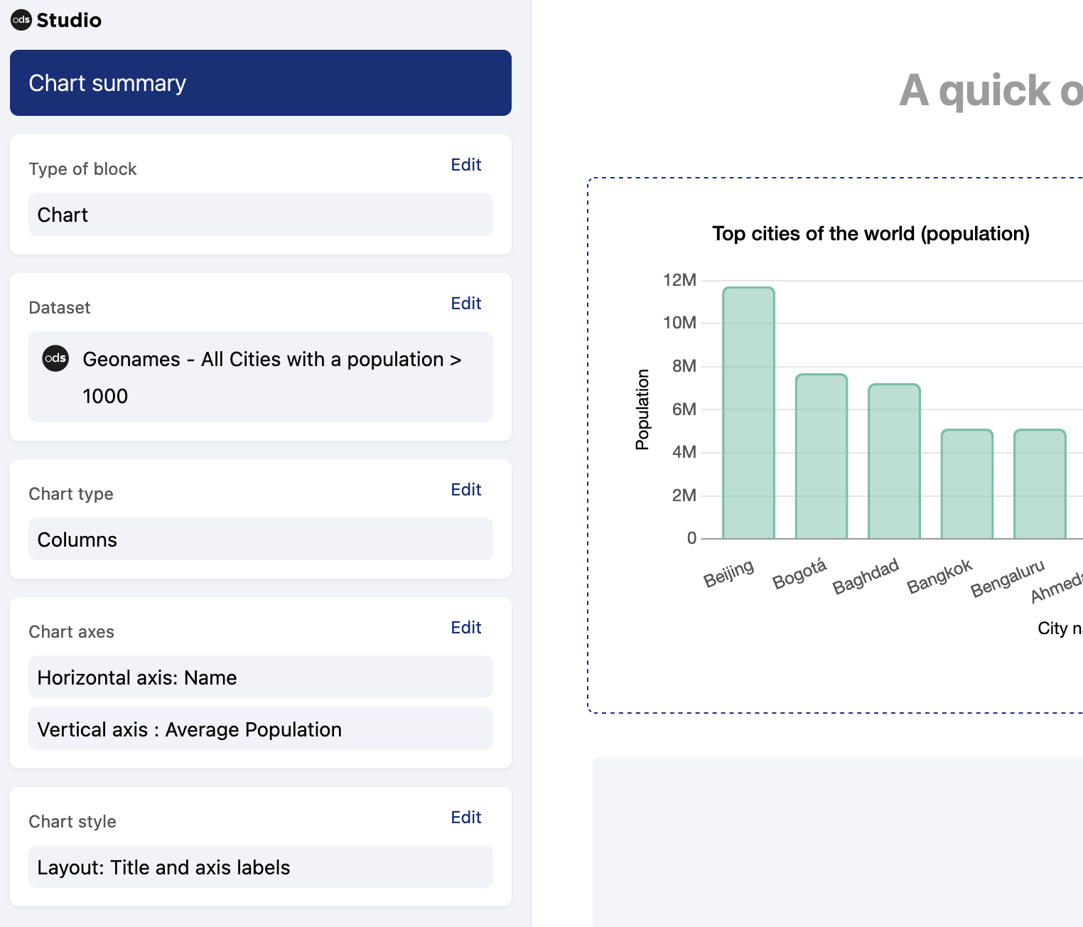
Verify your configuration and click Save, and your chart will be visible in the preview pane.
Remember that you can always click the block again in the preview pane to check and edit the configuration.