
Customizing portal themes
The default theme of your portals can be customized, not only in terms of layout and colors but also regarding specific areas such as header, footer, and catalog cards.
Style configurations are managed from the Portal > Style page in your back office.
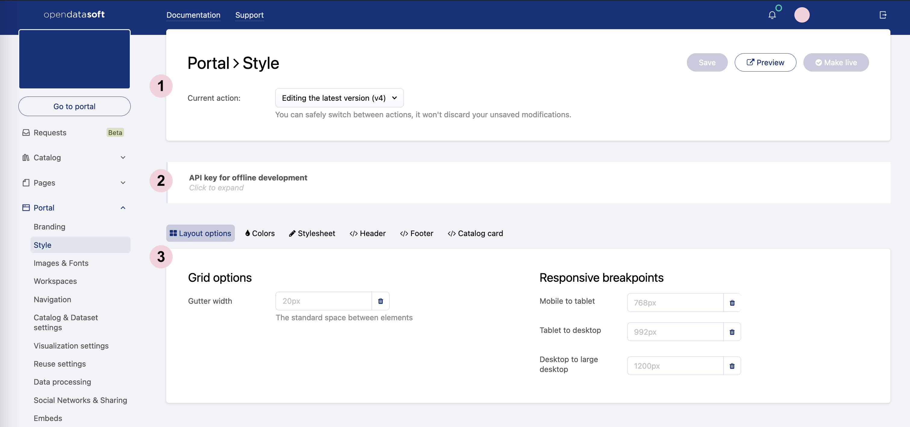
The Style tab has three main blocks:
The header, which displays a "Current action" drop-down menu to manage versioning (see Versioning themes below). Three important buttons are also displayed in the header:
1. Save, to save the new configurations
2. Preview, to open in a new tab previewing your portal with the newly applied configurations
3. Make live, to apply the newly applied configurations and update the live theme on your portalThe API key for offline development management block, which allows the use and generation of new API keys.
Note that it is possible to create stylesheets outside the platform, with any standard web developing tool, and to push them to the platform using an API key. For an easier and quicker usage, the Opendatasoft Portal Development Kit is at your disposal: it is an open-source project created by Opendatasoft that can be downloaded on Github.To find and use a theme API key, click on the API key for offline development block to expand it. The current API key is displayed in the block, ready to be copied and used.It's also possible to generate a new API key by clicking on the Generate new key button. However, be careful when generating new API keys: only the current one can be used, which means that generating a new API key revokes all previous ones.
A block of six tabs, each one allowing to configure a part of an Opendatasoft portal theme (see Customizing a portal theme below):
Layout options, to modify the portal's general layout
Colors, to change the colors of backgrounds, texts, borders, links, etc.
Stylesheet, to add more style to the portal with CSS
Header, to modify the header with HTML code
Footer, to modify the footer with HTML code
Catalog card, to modify the catalog cards with HTML code
Versioning themes
Portal themes are versioned, which means that each customized new theme has a version number assigned to it. Once a theme is finished and made live, another version is automatically created, which is the new draft theme on which to work until it is ready to be live.
The "Current action" drop-down menu displayed in the header indicates which version is currently being worked on. It allows you to select previous themes that were already made live.
Once a theme is live, it is locked and can no longer be modified. Only the latest draft version can be modified.
While working on the latest draft version of the portal theme, it is possible to preview what the portal will look like with this new theme. The Preview button is opens a new tab that shows what the portal configured with the draft theme would look like.
Only users able to edit workspace properties can preview the latest theme version. If sharing the URL with other users who were not granted the right permissions, they will simply see the portal with the current live theme.
Customizing a portal theme
Layout options
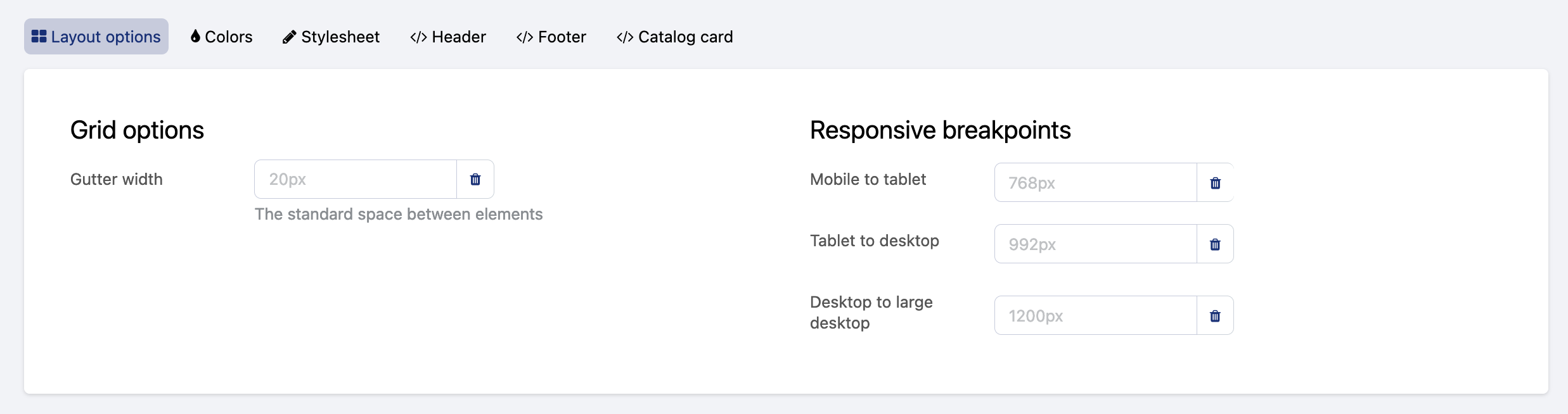
The Layout options tab allows to customize the portal layout, which by default relies on a 12-columns grid system inherited from the Bootstrap CSS framework.
More specifically, in this tab, it's possible to modify:
The gutter width, which is the space, in pixels, between the various elements that compose an interface of the portal (columns, rows, and boxes)
The responsive breakpoints, which are the various screen widths, in pixels, at which the layout should change to adapt to the available space (for example, the portal layout should differ depending on whether it is used from a mobile phone or a desktop because the screen of a mobile phone is much smaller than that of a desktop). A web interface that adapts depending on the screen width is indeed called "responsive." There are three configurable breakpoints between four standard screen sizes associated with common devices:
Mobile to tablet, to go from an extra-small screen to a small screen
Tablet to desktop, to go from a small screen to a medium screen
Desktop to large desktop, to go from a medium screen to a large screen
Mobile, tablet, desktop, and large desktop are used as reference because they are common devices that illustrate quite well the four standard screen sizes (extra-small, small, medium, and large) that can be encountered. Keep in mind that mobile, for example, doesn't mean that the user is actually using a mobile device, but rather that the browser used by the user only offers an extra-small display area.
To modify a layout option:
Write a new width, in pixels, in the chosen textbox.
Click on the Save button in the top right corner.
To reset any layout option to its default value, click on the trash button.
Colors
The Colors tab allows you to customize the colors used in the portal's texts and links, backgrounds, and borders.
If a custom stylesheet has been created for the portal, the CSS rules that it contains will have precedence over the colors defined in the Colors tab.
The color of the following elements of an Opendatasoft portal can be configured in this tab:
Category | Configurable elements |
Text |
|
Background |
|
Borders |
|
To modify a theme color:
In the chosen textbox, write the hexadecimal code of the new color, or click the color button to choose a new color using either the "Nice colors" or the "Color wheel."
Click on the Save button in the top right corner.
To reset to the color of the currently live portal theme, click on the Reset button.
Theme colors can be used in the domain stylesheet, as CSS variables:var(--variable-name)The available variables are: text, links, titles, page-background, highlight, boxes-background, boxes-border, section-titles, section-titles-background, header-background, header-links, footer-background and footer-links.These CSS variables are compatible with all browsers because the Opendatasoft platform automatically replaces all variables with their real theme color values.
Stylesheet
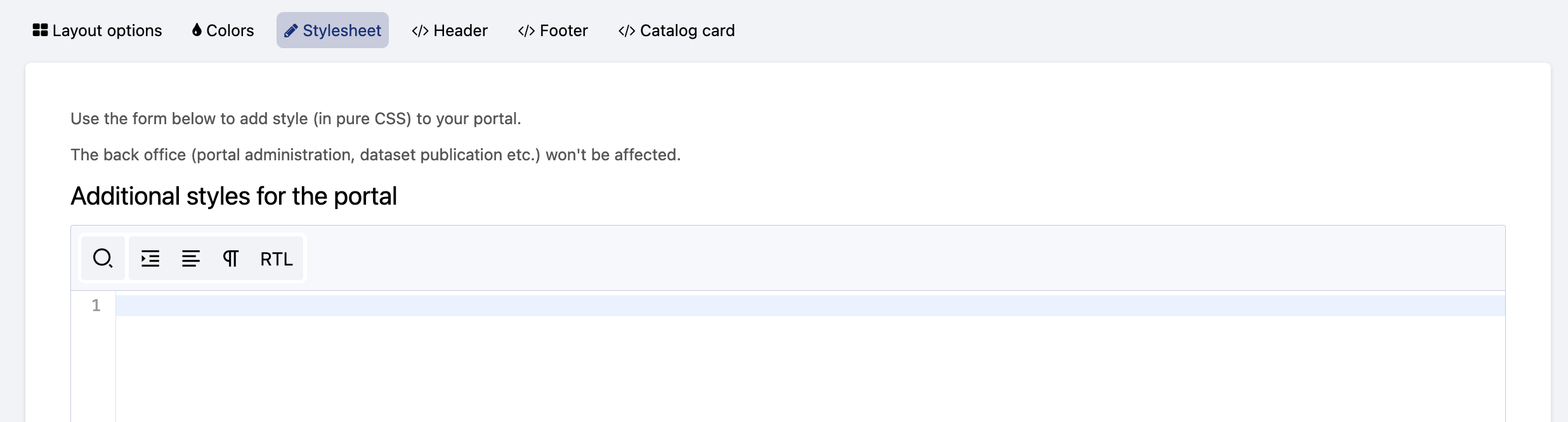
The Stylesheet tab displays an editor in which to add pure CSS style rules. It allows you to push the customization of a portal theme even further.
All rules added in this tab will have precedence over the configurations defined in the other theme tabs.
To change the style of an element, find the element's class and change the desired CSS property. Class names are written as block, element, modifier: .ods-block[--blockmodifier][__element][--elementmodifier].
When using specific images and fonts for the customization of the workspace, don't hesitate to upload them as assets in the platform (see Adding assets). This allows your to easily copy the assets' URLs and paste them into the CSS code.
Header and Footer
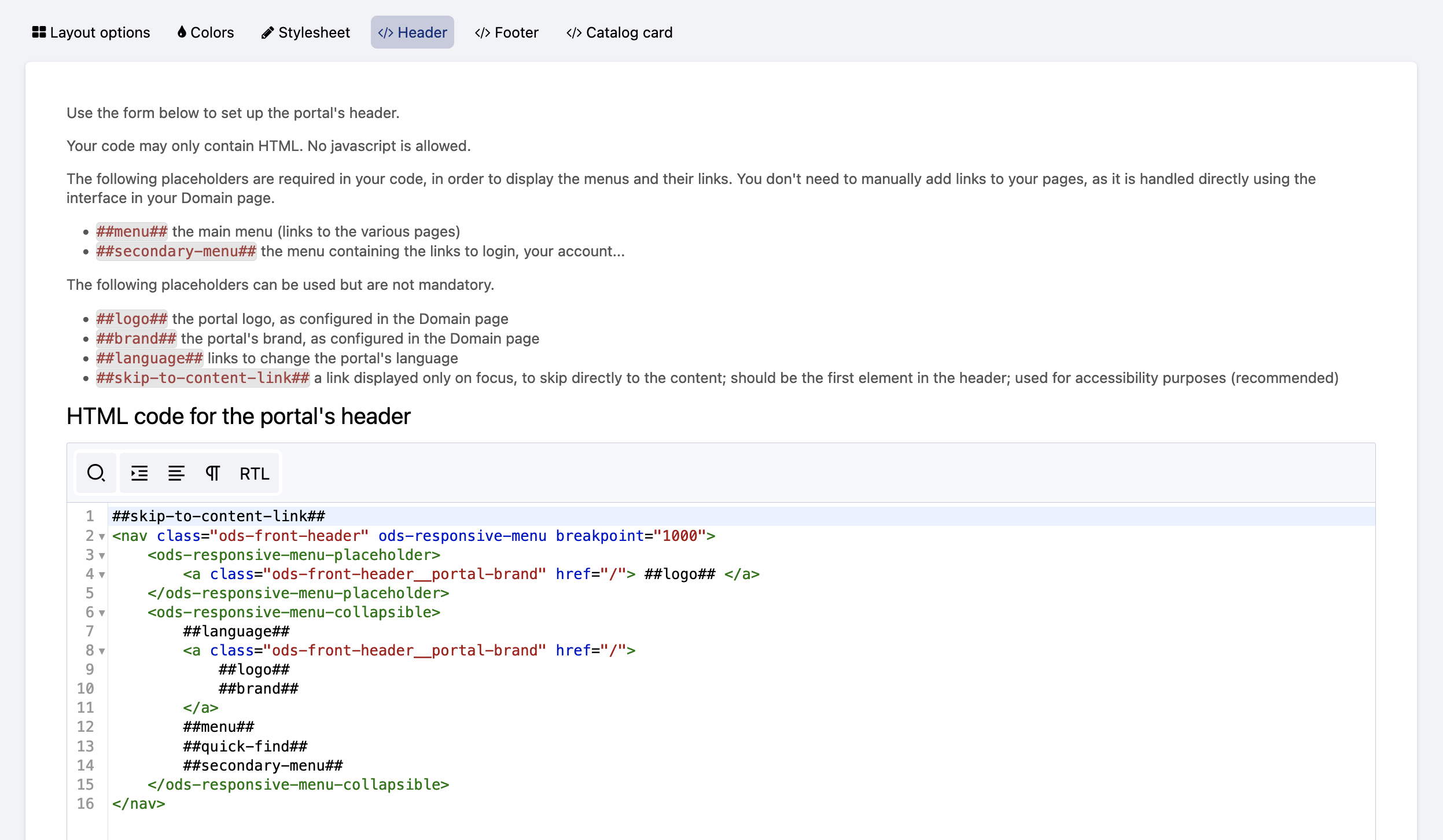
The Header and Footer tabs each display an editor in which to add pure HTML. Although both the header and the footer can be partially customized via the Colors tab, these tabs allow you to push the customization of these areas of the portal even further.
Both the header and the footer are wrapped within independent AngularJS applications, which means that standard Angular directives such as ng-if, ng-class, ng-show, and ng-hide can be used.
To collapse the header into a click-to-expand side menu below a certain viewport width, use the ods-responsive-menu directive.
Placeholders can also be used when customizing the header and the footer. They will be replaced with the content specified in the domain customization options such as menu items, language selectors, and logos.
The following placeholders are available in the Header tab:
Placeholder | Information |
| Main menu, with links to chosen pages |
| Menu containing links to login page and user account |
| Portal logo configured in Branding |
| Portal brand configured in Branding |
| Links to change the language of the portal |
The following placeholders are available in the Footer tab:
Placeholder | Information |
| Link to the Terms & Conditions defined for the portal, configured in Legals |
| Link for users to modify their cookies preferences. This placeholder is mandatory to enable the cookie banner. For more information, see Managing legal information. |
| Language picker for the languages specified for the portal |
| Opendatasoft logo |
Note that JavaScript is not allowed for security reasons.
Catalog card
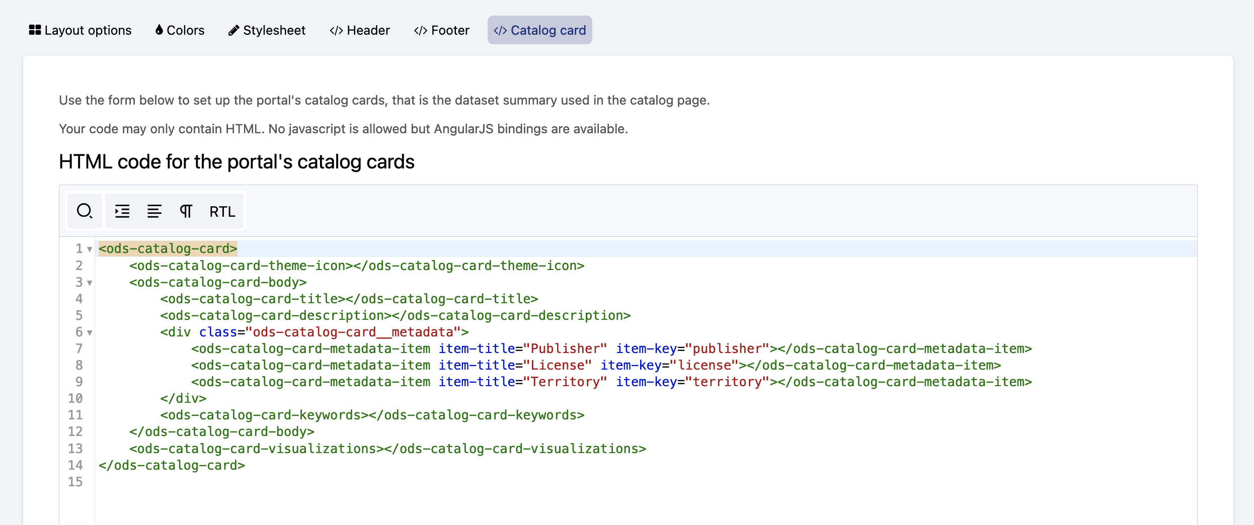
The Catalog card tab displays an editor in which to add pure HTML. It allows to customize the catalog cards displayed in the portal's catalog, and which represent the published datasets of that portal (see Exploring a dataset from the catalog).
The following directives allow to retrieve information related to a dataset, which could be included in the catalog card.
Directives used in the Catalog card tab come with a standard style, which can be modified in the Stylesheet tab.
Directive | Information | ||||||||||||||||||||||||||
| Mandatory. Wraps the whole catalog card for the other directives to work | ||||||||||||||||||||||||||
| Retrieves the dataset's theme and includes the related icon | ||||||||||||||||||||||||||
| Provides useful style and behavior handling edge cases (for example, datasets without records) | ||||||||||||||||||||||||||
| Retrieves the title of the dataset | ||||||||||||||||||||||||||
| Retrieves the description of the dataset | ||||||||||||||||||||||||||
| Retrieves the keywords defined for the dataset | ||||||||||||||||||||||||||
| Takes an Example: The table below lists all available metadata item keys:
|