
Configuring the calendar visualization
For the "Calendar" visualization to be available, the dataset must contain at least one date or datetime field, and a text field containing the title of the calendar event.
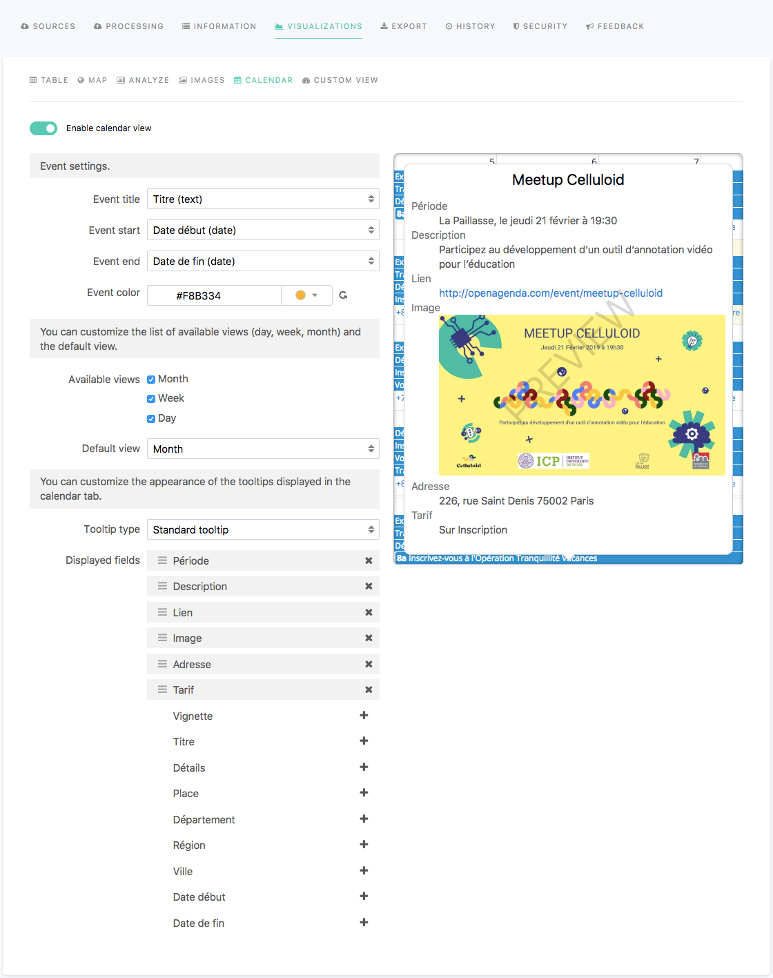
In the edition interface of a dataset, the Visualizations > Calendar tab allows you to configure the calendar visualization displayed in the portal once the dataset is published.
The calendar visualization, when available, is optional. It can be enabled or disabled using the tick box displayed right under the visualizations tabs.
Once the calendar visualization is enabled, the published dataset can be exported in iCalendar format from the Export tab in the portal.
To configure the calendar visualization, follow the indications from the tables below.
Option name | Description | Usage |
Event title | Title of the event, used as a tooltip title. |
|
Event start | Start date of the event. |
|
Event end | End date of the event. |
|
Event color | Color of the event on the calendar visualization. |
|
Available views | Three possible views on which to display events of the Calendar view:
| Tick a box to display a chosen view. Untick a box to hide a chosen view. |
Default view | Default view when landing on the calendar visualization tab. |
|
Tooltip types | Two tooltip types:
|
|
Standard tooltip options
Option name | Description | Usage |
Displayed fields | Fields from the dataset which values will be displayed in the tooltip. In the list, the fields with a grey background are those that will be displayed in the tooltip, whereas those without a colored background will be hidden from the tooltip. | To add a field in the tooltip:
To hide a field from the tooltip:
To reorder the fields:
|
Custom HTML tooltip options
Option name | Description | Usage |
Custom HTML tooltip | HTML area to write the content of the tooltip. Three buttons above the text area allow to reindent a selection, reindent the whole HTML text, or to wrap the lines. | Write the content of the tooltip in HTML. |