
Analyzing a single dataset with its monitoring dashboard
Users must have the "Browse analytics" permission to consult the Analytics dashboards.
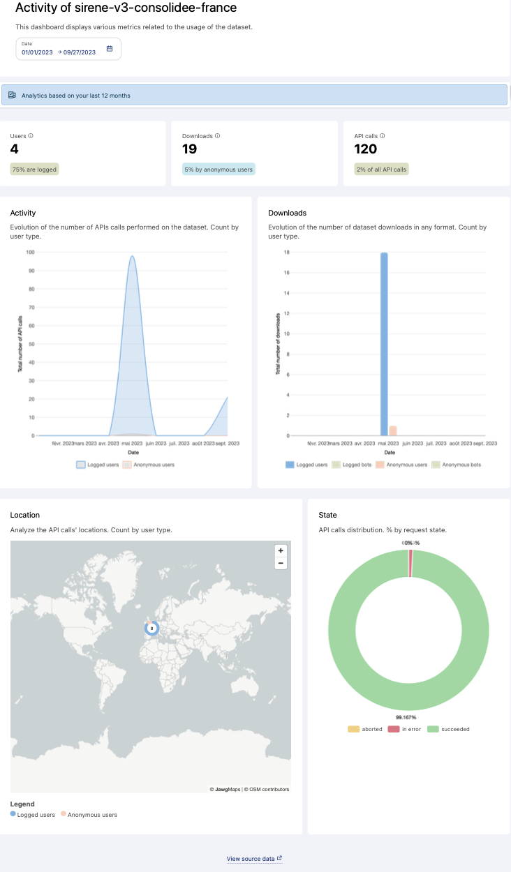
Usage analytics dashboards display various metrics related to how your datasets are being used.
To see the dashboard for a given dataset, go to your Catalog > Datasets page. There, click on the dataset's Monitoring icon (a small chart—see below).

Filtering by date
By default, the filter is set to a one-month period, but you can specify the time period you wish to analyze.
Key indicators
Three key performance indicators are available:
Users: The estimated number of unique users who interacted with the dataset. The percentage represents the portion made up of logged users.
Note that we use the count of logged users (field user_id with an identifier). An anonymous visitor corresponds to the distinct counting of IP addresses when the user_id has the value "anonymous." As such, this type of counting does not provide an accurate user count, but does provides a broad measure of how much user activity there is on that dataset.
Downloads: The total number of times the dataset was downloaded (we used the following request
(api = export_dataset OR api = alternative_export_lookup OR api = download_dataset OR api = download_dataset_alternative_export OR api = download_dataset_records) AND attributes is null)). The percentage represents the part of the downloads made anonymously.API calls: The total number of API calls performed on the dataset. The percentage represents the proportion of dataset usage compared to your total number of API calls during the selected period.
Understanding your dataset's activity
Activity: The chart shows the number of API calls on the dataset over time, by both anonymous users and users who are logged in.
Downloads: This chart shows the number of times your dataset was downloaded by user type: Anonymous users, and users who are logged in. Statistics for bots also allow you to see the portion of automatic downloads.
Location: The map allows you to visualize the geographical origin of API calls by user type (logged-in or anonymous).
Note that IP geolocation is inherently imprecise, and this may be reflected in the map.
State: This chart allows you to evaluate the performance of API calls made to the dataset (requests made successfully, aborted, or in error) over the selected period.
The underlying data
To do your own analysis, you can click on See source data at the bottom of the page to obtain the entire dataset these charts are based on. See this documentation to learn more about the API fields being recorded in the underlying data.