
The basics of dataset visualizations
When your users visit one of your datasets, at the top of the dataset they will see any number of tabs that allow them to visualize that data: Table, Map, Analyze, Images, Calendar, and Custom view.
Note that in some cases, if the dataset does not support a visualization that tab will not be present. For example if the dataset does not have geographical data, the Map tab will not be visible.
To configure a dataset's visualizations, go to your back office under the Visualizations tab to find a sub-tab for each kind of visualization. If a visualization is not available for a given dataset, that tab will be grayed out.
Dataset information
The Information tab gives access to all kind of information about the dataset. It's often the default landing tab when clicking on a dataset from within a catalog.
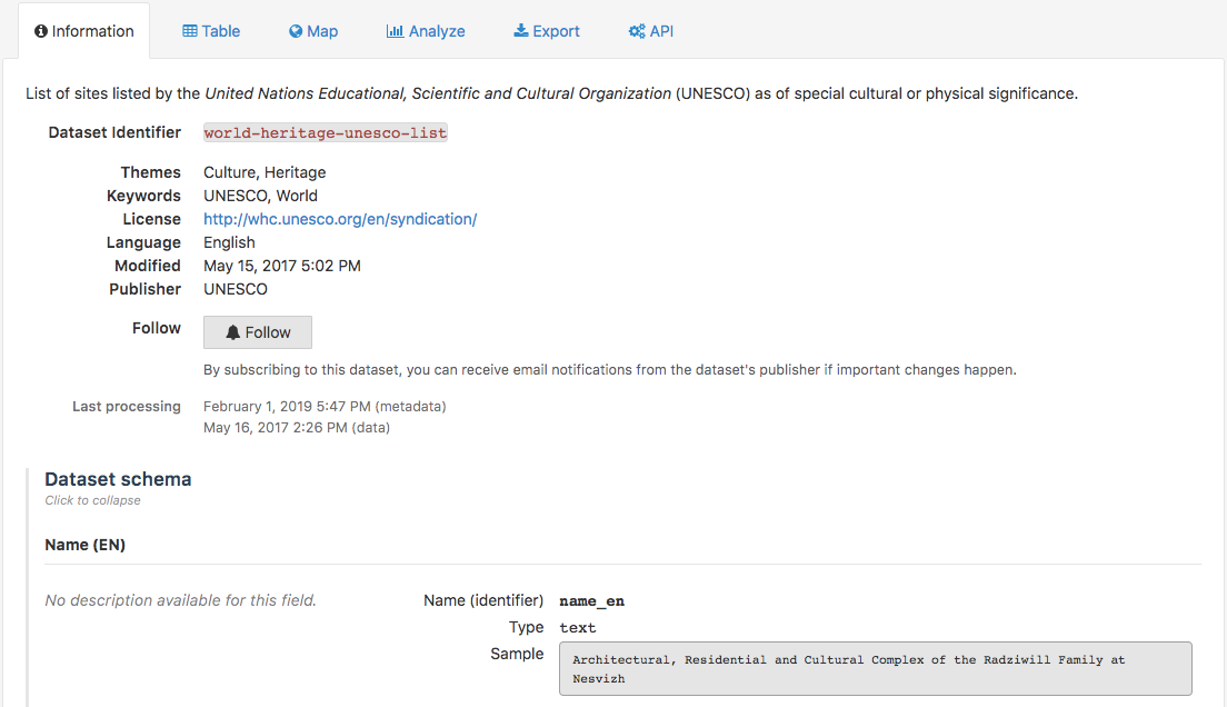
The Information tab contains:
The metadata of the dataset, that have been filled out by the portal administrators
A Follow button to subscribe to the dataset (see Following dataset updates for more information)
The dates of last processing for metadata and data
The dataset schema, which indicates for each field of the dataset
The label
The description
The technical identifier
The field type
An example of value from this field
The reuses listing and reuse submit form (see Discovering and submitting data reuses for more information)
Depending on the portal and dataset configurations, more or less information and features may be displayed in the information tab of the chosen dataset.
Visualizing data
Published datasets on an Opendatasoft portal can be represented by up to six different visualizations. The number of available visualizations for a dataset depends on the kinds of data it contains. Among these six visualizations, there are five standard visualizations:
The Table visualization, to visualize data in a table
The Map visualization, to visualize data on a map
The Analyze visualization, to visualize and analyze data through a chart
The Images visualization, to visualize data through images
The Calendar visualization, to visualize data in a calendar
The sixth visualization is called the "Custom view." It is optional and can be customized. Even the label of the tab is chosen by the portal administrators, so can differ from one dataset to another even if they are on the same portal.
Visualizing data in a table
The Table visualization is accessible from the Table tab.
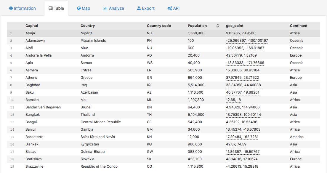
It displays a table containing all available fields from the dataset.
In the header, the bold labels are the field names.
In the table, each row represents a record. Each record contains several values.
Hover over the field names to display the description of the field.
The Table visualization can be available for any dataset, no matter what kind of data it contains.
Visualizing data on a map
The Map visualization is accessible from the Map tab.
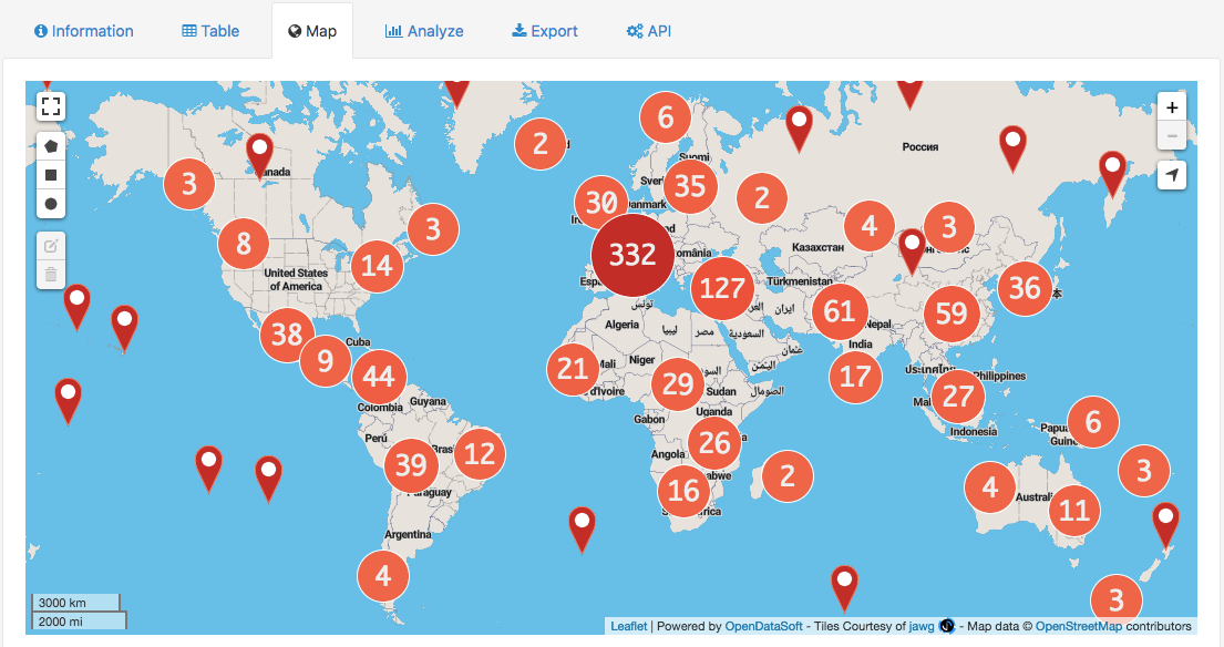
It displays a map, on which there are map markers indicating the geographical location of a record from the dataset. When clicking on a map marker, its related tooltip is displayed. It contains more information about the record.
Since the tooltips can be completely customized, their content can differ a lot from one dataset to another. They can also be disabled.
Sometimes, the map markers can be replaced by circles containing a number. Those are called "clusters": they appear on a map when there are too many map markers in the same spot for them all to be displayed individually. The number indicated on the cluster indicates how many map markers are "hidden" behind. Zoom in to see the map markers.
The map contains the a variety of buttons that allow to navigate and interact with the map:
Polygon, circle and square button to draw on the map and filter on certain areas, along with the edit shape and delete shape buttons to go with them
Extend button to view your map in fullscreen mode
Zoom in and zoom out buttons
Localize button to focus the map on your current location
Maps displayed in the Map tab cannot be customized, except from choosing another basemap when possible. To be able to customize a map, or cross data from different datasets, as well as to save a created map, use the Map Builder.
Visualizing data through a chart
The chart visualization is accessible from the Analyze tab.
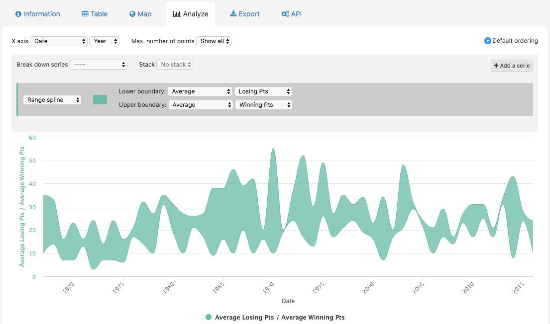
It displays a default chart, set by the portal administrators. It is however possible, and encouraged, to configure other charts to make other analysis than the default one.
Above the chart are displayed a variety of buttons and options to configure the chart:

The first line is to configure the base of the chart.
X axis: to choose which field to use as X axis (horizontal line)
Max. number of points: to choose how many points should be represented on the chart
Default ordering: for points to be displayed in a decreasing order in the chart

The second line is to define how the different series are represented.
Break down series: to separate the series into several groups
Stack: for series to be stacked one on top of the other
Add a serie: to display other series on the chart

The third and last line is to configure series separately.
a scroll-down menu: to choose a chart type for the series
a color or color palette: to choose the color of the series
Y axis: to choose which field to use as Y axis (vertical line)
Use for ordering: for points to be displayed in a decreasing order in the chart, based on the chosen series
Charts displayed in the Analyze tab can be modified. However, these modifications cannot be saved. To be able to save a created chart, as well as to cross data from different datasets, use the Chart Builder.
Visualizing data through images
The images visualization is accessible from the Images tab.
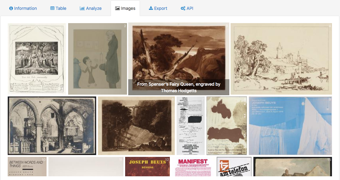
It displays the thumbnails of the images of the dataset. When clicking on a thumbnail, the metadata of the image are displayed. Below the metadata is also displayed a Download image button, to download the selected image.
Visualizing data in a calendar
The calendar visualization is accessible from the Calendar tab.
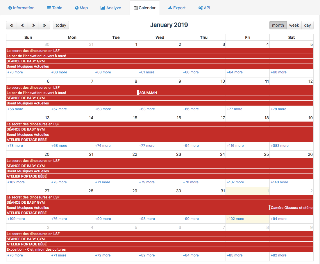
It displays a calendar on which events of the dataset are displayed. When clicking on an event, its related tooltip is displayed. It contains more information about the event.
Since the tooltips can be completely customized, their content can differ a lot from one dataset to another. They can also be disabled.
Above the calendar are displayed a variety of buttons to navigate the calendar:
Double arrow buttons to see the dates of the current calendar page a year earlier or later
Arrow buttons to see the month/week/day earlier or later the current calendar page
Today to display today's calendar page
Month, week, day for the calendar page to display a whole month, week or just a day