Creating multi-layer maps

Patrick Smith Updated by Patrick Smith

Add a dataset to your map

  1. Inside the "My maps" interface, in the layer editing area, click on Add a dataset to this map.
  2. Choose the dataset you want to display on your map. You can select a dataset with geographical information either from your own catalog of datasets published on your domain or from the All available data catalog.
  3. Click on Select if you want to add all data or Filter data if you just want to add part of the data.
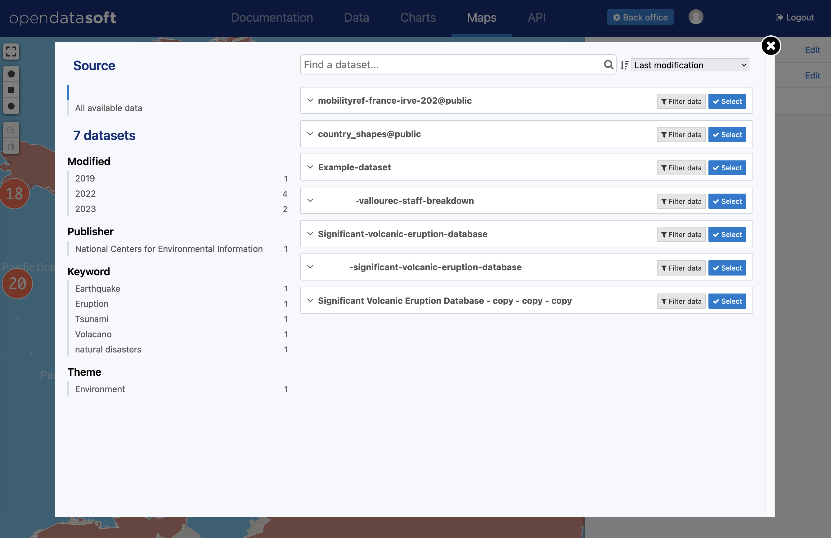
You can change dataset or change which part is filtered at any time. To do so, simply click on Change filter next to the layer’s title.

You can add as many datasets as you want on your map, and all of the data they contain can be displayed on that same map at the same time. This is when the whole concept of layers comes into play. In the Maps interface, because you overlay several datasets, each dataset is called a layer. This is why Maps allows you to configure your layers to make sure that you can represent many different data on the same map and still make the reading of this map easy and clear.

Keep in mind that the more datasets you add to your map, the heavier it will be and the longer it will take to load.

Edit a layer

Editing a layer (meaning, a dataset displayed on a map created with Maps) has two parts:

  • Display: the style, in other words, how the data is displayed on the map
  • Information: the information and caption that go with the dataset in order to better describe it

Edit style

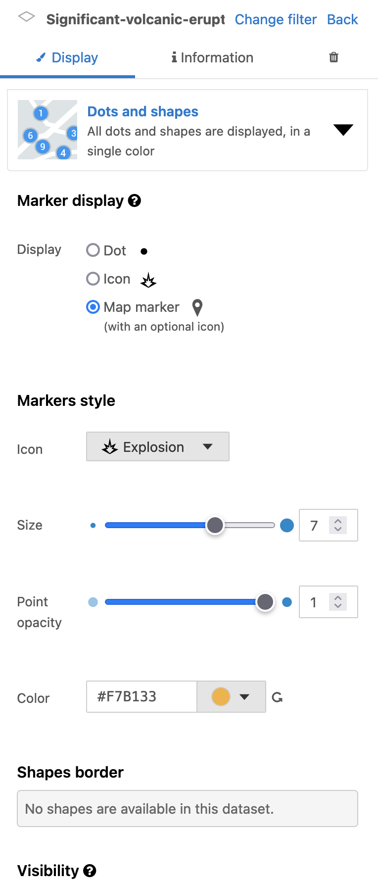
  1. Click on the Display tab. The menu with all style configurations drops down.
  2. Choose a visualization mode and configure your layer as you like.

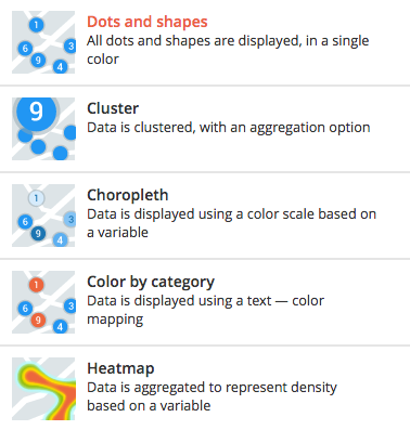
The style configurations entirely depend on the visualization mode you choose to apply to your layer. There are five different modes:

The style configurations displayed for each visualization mode also depend on your dataset. Depending on the dataset you added to your Maps map, you may not see all the configurations explained in this documentation.

Dots and shapes

The Dots and shapes visualization mode simply displays your data as markers (dots or icons) or as shapes. It is the most common visualization mode.

Style configuration

Description

Marker display

What your data will look like on the map

  • Dot: simple plain circle. Dots are recommended for high-density datasets
  • Icon: themed icon (available in the Opendatasoft library)
  • Map marker (with an optional icon): standard drop-shaped map marker, with an optional themed icon (available in the Opendatasoft library) inside

If you choose the Icon or the Map marker (with an optional icon) mode:

  1. In the Shapes style section below the Market display section, click on the Icon menu
  2. Choose the icon which will represent your data the best
  3. Click on the Select icon button

Shape styles

Customize your markers and shapes

  • Icon: choose an icon for both the Icon and Map marker (with an optional icon) modes (see procedure above)
  • Size: make your dots/icons larger or smaller
  • Point opacity: if your markers are dots or icons - add transparency to these markers
  • Shape opacity: if your data are represented as shapes instead of markers (dots or icons) - increase or decrease their transparency
  • Line thickness: if your data are represented as lines - increase or decrease their thickness

For all the options above, simply drag the dot along the slider or directly change the numbers displayed on the right of each slider.

  • Color: change the color of your markers, shapes, and lines

To change the color:

  1. Click on the color menu
  2. Choose the color you want from the Nice colors or with the Color picker
  3. Click on the Select color button

Shape borders

Customize the border of your markers and shapes

Borders are only available for shapes and dots. Icons, and map markers do not have borders.
  • Pattern: choose the pattern of the border, whether you want it to be a simple line or a dashed or dotted line

For the Pattern option, simply click on the provided menu and choose the one you want.

  • Thickness: make the border of your shapes thicker or thinner
  • Opacity: increase or decrease the transparency of the border

For the options above, simply drag the dot along the slider or directly change the numbers displayed on the right of each line.

  • Color: change the color of the border

To change the color:

  1. Click on the color menu
  2. Choose the color you want from the Nice colors or with the Color picker
  3. Click on the Select color button

Cluster

The cluster visualization mode groups your data into clusters instead of displaying them separately and individually. Clusters are grouped according to a chosen type of calculation: linear or logarithmic.

Style configuration

Description

Cluster style

What your cluster will look like on the map

  • Min size: choose the size of the smallest clusters
  • Max size: choose the size of the biggest clusters
  • Opacity: increase or decrease the transparency of your clusters

For all the options above, simply drag the dot along the slider or directly change the numbers displayed on the right of each slider.

  • Color: change the color of the border

To change the color:

  1. Click on the color menu
  2. Choose the color you want from the Nice colors or with the Color picker
  3. Click on the Select color button

Cluster border

Customize the border of your clusters

  • Thickness: make the border of your clusters more or less thick
  • Opacity: add transparency to the border

For the options above, simply drag the dot along the slider or directly change the numbers displayed on the right of each slider.

  • Color: change the color of the border

To change the color:

  1. Click on the color menu
  2. Choose the color you want from the Nice colors or with the Color picker
  3. Click on the Select color button

Aggregation operations

Choose the base operation for your clusters

Choose, out of the available operations, which one you want your clusters to be based on. The result value will be displayed inside the cluster.

  • Count: how many markers are in the area
  • Average: the average of a selected field from the dataset
  • Sum: the total of a selected field from the dataset
  • Minimum: the minimum of a selected field from the dataset
  • Maximum: the maximum of a selected field from the dataset
  • Standard deviation: the standard deviation of a selected field from the dataset, to indicate whether the values are close to the average or not

Computing

Choose how the size of the clusters is calculated

  • Linear: for your values ranges to be the same size, evenly spread from the minimum to the maximum (for example, 1, 2, 3, 4)
  • Logarithmic: for your values to vary in size and spread from a very large spectrum (for example, 1, 10, 100)

Choropleth

The choropleth visualization mode displays data as markers (dots or icons) or as shapes. It also enhances the visualization with colors. The markers and/or shapes are colored according to a color scheme, defined by a values range based on a chosen variable. The Choropleth mode allows the creation of a thematic layer.

Style configuration

Description

Marker display

What your data will look like on the map

  • Dot: simple plain circle. Dots are recommended for high-density datasets
  • Icon: themed icon (available in the Opendatasoft library)
  • Map marker (with an optional icon): standard drop-shaped map marker, with an optional themed icon (available in the Opendatasoft library) inside

If you choose the Icon or the Map marker (with an optional icon) mode:

  1. In the Shapes style section below the Market display section, click on the Icon menu
  2. Choose the icon which will represent your data the best
  3. Click on the Select icon button

Shape styles

Customize your dots and shapes

  • Icon: choose an icon for both the Icon and Map marker (with an optional icon) modes (see procedure above)
  • Size: make your dots/icons larger or smaller
  • Point opacity: if your markers are dots or icons - add transparency to these markers
  • Shape opacity: if your data are represented as shapes instead of markers (dots or icons) - increase or decrease their transparency
  • Line thickness: if your data are represented as lines - increase or decrease their thickness

For all the options above, simply drag the dot along the slider or directly change the numbers displayed on the right of each slider.

  • Palette: define on which field and operation your choropleth layer will be based on, and the color of your markers, shapes, or lines
    1. Choose whether you want to base the color of your shape on the Value of a field or on the Aggregation on a field
    2. Depending on the choice you just made for your shape’s color, choose the field which value you want to use, or decide which aggregation operation you want to apply on your chosen field
    3. Define the Values range
    4. Define the number of Tiers, meaning in how many categories your values range will be divided
    5. Choose a computing modelinear (for your values ranges to be the same size, evenly spread from the minimum to the maximum), logarithmic (for your values to vary in size and spread from a very large spectrum) or custom
    6. Choose the colors range by clicking the colors menu and selecting your colors
    7. Choose a gradient type (RGB, Lab, HSL or Lch), meaning a way to calculate the color gradient between the two colors you just chose

Shape borders

Customize the border of your shapes

Borders are only available for dots and shapes. Icons and map markers do not have borders.
  • Pattern: choose the pattern of the border, whether you want it to be a simple line or a dashed or dotted line

For the Pattern option, simply click on the provided menu and choose the one you want.

  • Thickness: make the border of your shapes thicker or thinner
  • Opacity: increase or decrease the transparency of the border

For the options above, simply drag the dot along the slider or directly change the numbers displayed on the right of each line.

  • Color: change the color of the border

To change the color:

  1. Click on the color menu
  2. Choose the color you want from the Nice colors or with the Color picker
  3. Click on the Select color button

Color by category

The Color by category visualization mode displays data as markers (dots or icons) or as shapes. It also enhances the visualization with colors. The markers and/or shapes are colored according to a color scheme based on defined categories - which can be numerical or not, just defined by a certain word. The Color by category mode allows the creation of a categorized layer.

Style configuration

Description

Marker display

What your data will look like on the map

  • Dot: simple plain circle. Dots are recommended for high-density datasets
  • Icon: themed icon (available in the Opendatasoft library)
  • Map marker (with an optional icon): standard drop-shaped map marker, with an optional themed icon (available in the Opendatasoft library) inside

If you choose the Icon or the Map marker (with an optional icon) mode:

  1. In the Shapes style section below the Market display section, click on the Icon menu
  2. Choose the icon which will represent your data the best
  3. Click on the Select icon button

Shape styles

Customize your dots and shapes

  • Icon: choose an icon for both the Icon and Map marker (with an optional icon) modes (see procedure above)
  • Size: make your dots/icons larger or smaller
  • Point opacity: if your markers are dots or icons - add transparency to these markers
  • Shape opacity: if your data are represented as shapes instead of markers (dots or icons) - increase or decrease their transparency
  • Line thickness: if your data are represented as lines - increase or decrease their thickness

For all the options above, simply drag the dot along the slider or directly change the numbers displayed on the right of each slider.

  • Palette: choose whether you want:
    • to create a Custom palette based on a field’s value
    1. Click the Brush icon to access the custom palette interface
    2. Choose the field you want to categories to be based on
    3. Choose whether or not you want to enable the creation of an additional category
    4. Choose a color for each category
    5. Click the Apply button
    • or a palette Generated with colors contained in a field (in case your dataset already contains a field that provides color information: a hexadecimal color code, for example)

In that case, simply choose the right field, and the colors will automatically appear on the corresponding markers and/or dots of your map.

Shape borders

Customize the border of your markers and shapes

Borders are only available for dots and shapes. Icons and map markers do not have borders.
  • Pattern: choose the pattern of the border, whether you want it to be a simple line or a dashed or dotted line

For the Pattern option, simply click on the provided menu and choose the one you want.

  • Thickness: make the border of your shapes thicker or thinner
  • Opacity: increase or decrease the transparency of the border

For the options above, simply drag the dot along the slider or directly change the numbers displayed on the right of each line.

  • Color: change the color of the border

To change the color:

  1. Click on the color menu
  2. Choose the color you want from the Nice colors or with the Color picker
  3. Click on the Select color button

Heatmap

The Heatmap visualization mode is not about markers or shapes. Instead, this mode groups data and displays them as a span of colors to show the differences of intensity of one variable but at different spots in the map.

Style configuration

Description

Aggregation operations

Choose on what operation your heatmap is based.

Choose, out of the available operations depending on your dataset, which one you want your heatmap to be based on.

  • Count: how many markers are in the area
  • Average: the average of a selected field from the dataset
  • Sum: the total of a selected field from the dataset
  • Minimum: the minimum of a selected field from the dataset
  • Maximum: the maximum of a selected field from the dataset
  • Standard deviation: the standard deviation of a selected field from the dataset, to indicate whether the values are close to the average or not

Computing

Choose how is calculated the progression of your heatmap

  • Linear: for your values ranges to be the same size, evenly spread from the minimum to the maximum (for example, 1, 2, 3, 4)
  • Logarithmic: for your values to vary in size and spread from a very large spectrum (for example, 1, 10, 100)

Colors

Choose the color palette of your heatmap

  1. Click on the Edit palette button
  2. Choose your five colors
  3. Click on the Apply button

Add and edit information

  1. Click the Information tab
Title and description
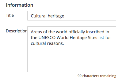
  1. Rename your layer in the Title area to make it clearer for the map viewers
  2. Add a Description in the provided area
If you do not add your own description, it is the default one that will be displayed.
Icon

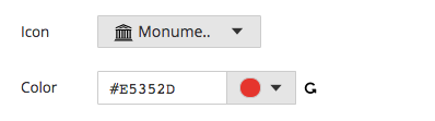
You can add an icon to your layer, which will be displayed next to the layer’s title.

  1. Click on the Icon drop-down menu to choose the icon that represents your layer the best
  2. Click on the Color menu to add a color to the layer’s icon

Add and edit a caption

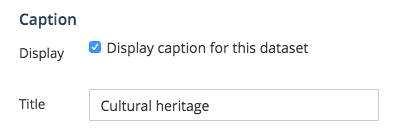
Captions are not mandatory. However, they are recommended because they add more information to your dataset, which means more clarity to the reading of your map.

  1. Click on the Caption tab
  2. If it’s not already the case, tick the Display caption for this dataset option
Captions are activated by default. If you do not want to display a caption for your dataset, simply untick the Display caption for this dataset option.
  1. In the provided area, write a Title for your layer’s caption

Delete a layer

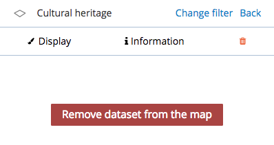
  1. Click on the delete icon
  2. Click on the red Remove dataset from the map button

How did we do?

Reorder and group layers in a map

Share your map

Table of Contents

Contact

Powered by HelpDocs (opens in a new tab)