
Adding a choropleth map block in Studio
Studio makes it easy to create points of interest maps and choropleth maps.
Choropleth maps are a powerful tool to visualize geographical statistics by using different shades of color to represent the different values in those areas. To create one in Studio, follow the directions below.
Step 1: Select a block
To create a choropleth, from the preview pane, click the block you want to edit. Then, from the left side pane, select Map as the block type and then Choropleth as the map type.
Remember that if you change your mind you can always change the block type afterward, though be aware that the block configuration will be reset if you do so.
Instead of using the Next button, note that you can double click on a card to select it and move on to the next step.
Step 2: Choose your map source
Standard maps
Standard maps offers built-in maps to make it easier to get started. The advantage is that you do not need geographic data, such as geopoint or geogeoshape data, in your dataset to create such a map.
Instead, Opendatasoft provides a map of the world, plus administrative divisions for 15 major countries. Our data comes from official geographic references for each supported country (see here for the list of countries).
Write the name of the geographical zone you're looking for and the search bar will suggest several results for you to choose from.
Note that each entry in the list of results also lists its location and administrative level.
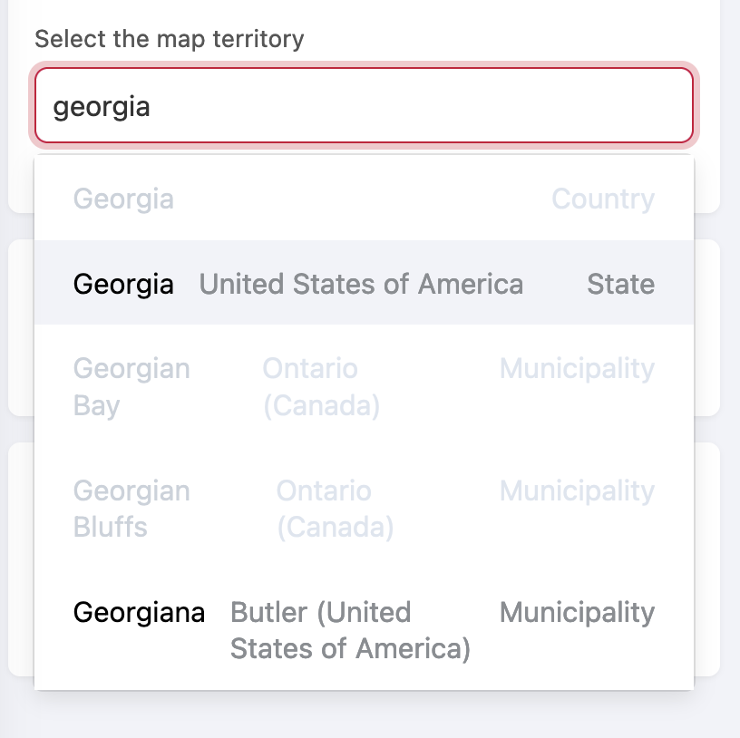
Note that only levels with subdivisions can be selected. In the image above, note how the country Georgia is grayed-out. To display a map of Georgia or any other country for which there are no lower subdivisions, you can use the "World" map. So, for the lowest administrative levels available, you should use a higher administrative level with the appropriate breakdown, or else use the My map option as described below.
Once you have chosen the territory, under "Breakdown of the map," choose the appropriate administrative sub-division.
Under "Choice of statistic," select the dataset that contains the statistics to plot on the map.
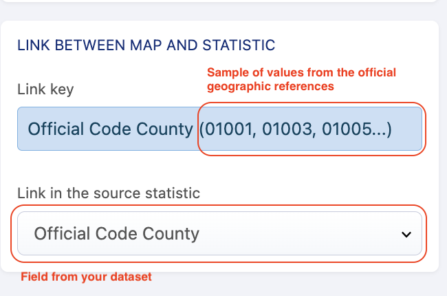
Link your geographical shapes and your statistics:
Studio automatically proposes a link key. The link key is the official code related to the administrative sub-division previously selected.
Under "Link in the source of statistic," choose the field from your dataset that contains the data you want to match up with the link key.

Finally, click Next.
My map
Choosing "My maps" allows you to create a map using your own geographic data.
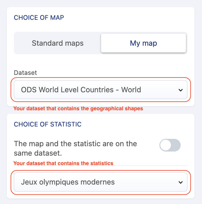
Under "Choice of map" you can select the "Dataset" you wish to use. When you click on Select a dataset, you're shown all of the datasets on your portail that contain geographic shapes. Once you choose one, the preview shows the shapes found in that dataset.
Under "Choice of statistics," select the dataset that contains the statistics you wish to plot on the map.
If the statistics are in the same dataset as the one with the shapes, activate the toggle. Then click on Next.
If the statistics and the shapes are in separate datasets, leave the toggle disabled. Then, click on Select a dataset to see the list of all the datasets on your portal.
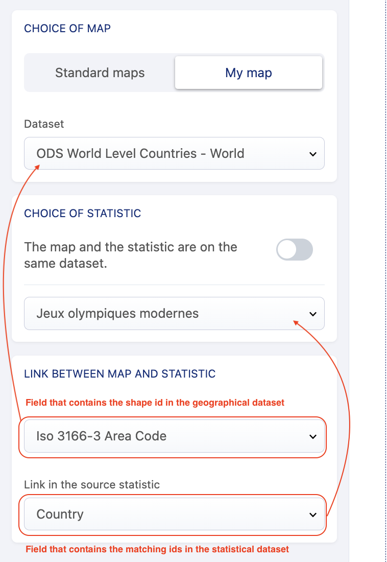
Under "Link between map and statistics":
Use Shape identifier to select, from the dataset you selected under "Choice of map," the field that contains the relevant codes.
Use Link in the source statistic to select, from the dataset selected under "Choice of statistics," the field that contains the relevant codes.
Click Next.


Step 3: Set the statistics
Now configure the data your map will display.
Under "Funtion," select a function from the list.
Under "Dataset field," select the field on which to apply this function. Note that the "Count records" function needs no field.
(optional) You can also refine the data shown on the chart:
Under the second section, click Add a condition.
Select the field from the input dataset.
Select an operator. Depending on the field type, the available operators may vary.
Click Confirm.
For more information, see Refining data.
Configure the information to display in the tooltip by selecting the field that contains the shape name you wish to set.
The preview underneath shows you how the information will be displayed—the shape name on top and the statistic beneath it.Make sure the field you chose has no missing values. A missing value will prevent the map from properly displaying the shapes and statistics.
Click Next.
Step 4: Set the style
Write the title you wish to have above the map legend.
From legend and colors, configure the way the legend will be displayed.
The colors come directly from the ones you configured in the back office menu, look & feel, data visualizations. If you haven't set any colors there, Studio will propose the default ODS colors.
You can choose the scale type between Steps and Continuous.
Choose the number of steps to use in the scale by clicking the number (between 2 and 8). This mode gives more contrast between steps; it is better to use it when you want to ease readability of regional trends. The more steps you add, the more contrasted the map should be.
Continuous automatically applies a gradient. This mode helps compare neighbor areas and enhance local similarities or differences.
Click Finish.
You can see the summary of the block configuration parameters in the side pane.
You can click any step to edit it.
If you do, you can save your map and return to the main menu.
Coming soon
We're working on improvements to Studio!
Boosting local territories in the suggestions
For now, some common city names in the United Kingdom, such as Newcastle, are not visible in the suggestions because of the number of cities that share that name in the British Commonwealth. We're working on the most user-friendly way to promote the cities you need.Filtering the data in the legend according to the chosen territory
This will improve upon the current behavior, where the legend of the map shows data from the whole dataset instead of only what's within the map view.