
Configuring the analyze visualization
For the "Analyze" visualization to be available, the dataset must contain at least one date or datetime field, or a field set to be a filter.
When editing a dataset, the Visualizations > Analyze tab allows you to configure the default chart of the analyze visualization displayed in the portal once the dataset is published.
The analyze visualization, when available, is optional. It can be enabled or disabled using the tick box displayed right under the visualizations tabs.
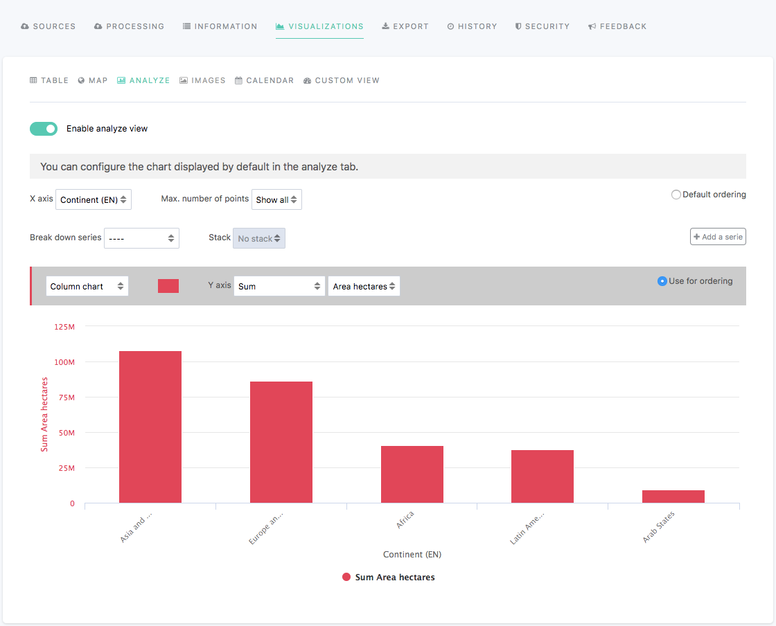
Above the chart preview are displayed a variety of buttons and options to configure the default chart of the analyze visualization:

The first line is to configure the base of the chart.
X-axis: to choose which field to use as X-axis (horizontal line)
Max. number of points: to choose how many points should be represented on the chart
Default ordering: for points to be displayed in a decreasing order in the chart

The second line is to define how the different series are represented.
Break down series: to separate the series into several groups
Stack: for series to be stacked one on top of the other
Add a series: to display other series on the chart

The third and last line is to configure the series separately.
a scroll-down menu: to choose a chart type for the series
a color or color palette: to choose the color of the series
Y-axis: to choose which field to use as Y-axis (vertical line)
Use for ordering: for points to be displayed in a decreasing order in the chart, based on the chosen series
Be careful with the default charts of distributed or federated datasets: If they were originally configured with custom colors, re-configure the chart with other colors. If you don't, the chart will appear blank.