
Illustrating your data
Once you’ve created a dataset in your Opendatasoft platform, that data is available to your users. They can:
Find it in your catalog
Browse its content
Download it
Consume it using APIs
But your data only shines when it’s explored and actually understood. Opendatasoft offers multiple ways to present your data and put it “onstage."
Opendatasoft gives you the tools to build dynamic visualizations and data stories, wherever and however you think is most appropriate for your users. This is an overview of those tools, and where to go to learn more.
The right illustration, in the right place
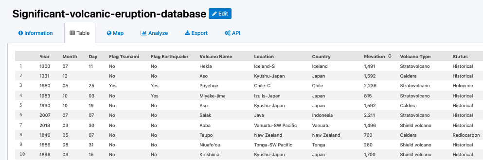
The most basic view of your data that a user can have is the list of your published datasets. Depending on the kind of data in your datasets, each one will have a number of different tabs—for example, every dataset has the basic Table view, but only datasets with geographic data will show the Map tab.
So first of all, you can customize how your data appears in each one of those tabs. This way users can better understand what the dataset truly contains.
Users can also explore multiple datasets together by using the Charts and Maps tools.
Even more powerful, with an Opendatasoft account, you can create pages and presentations with your data through our growing no-code data-illustration tool, the Studio.
And if you need something completely customized, you can still create your own pages with the Code editor and widgets.
Configuring the tabs in your dataset
When publishing your dataset, you have various ways to decide how your data will appear in your portal, including configuring how the various visualizations will be presented by default:
Defining what is visible in the table view, hiding columns that may be irrelevant or not suited for this view (e.g long texts)
Customizing how geographical data is shown in the map view
Showing a specific chart by default in the analyze view
Note that you can also create an additional, entirely customized view. This involves writing HTML and CSS to finely craft the visual representation you have in mind, and Opendatasoft widgets to insert interactive visualizations and filters.
Using the Map and Chart builders to see multi-layer visualizations
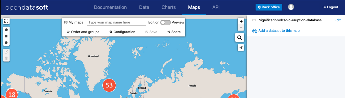
Two applications on your portal are dedicated to building maps or charts that combine multiple datasets, and are available to all users directly from the top menu in your portal.
Building data stories in the Studio
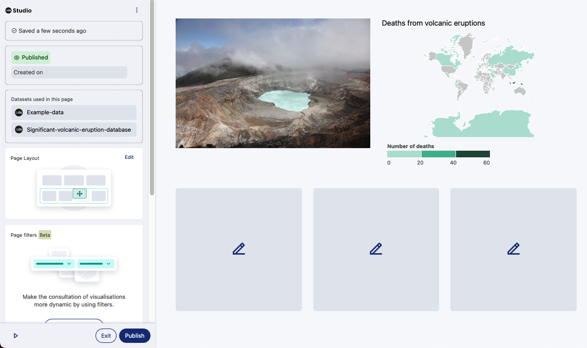
You may want to create a page to present your data with more context and detail. Maybe you need a page to document an initiative your company has undertaken. Perhaps you need a complex combination of several data sources, with interactive filters to let users discover insights on their own.
You can build all of these data stories using the Studio, a no-code editor designed to help you create powerful and accessible editorial content using your data.
Create advanced pages using the Code editor
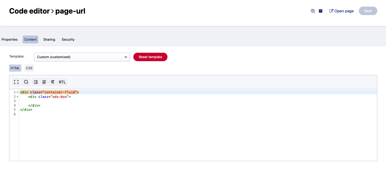
If you have a very specific page or application in mind, with precise interactions or workflow that the Studio does not yet provide, you can use the Code editor to build an entirely customized page. This will require writing HTML and CSS, and use ODS Widgets to include visualization and filters.