
ODS Forms: Input blocks
This page lists all possible input blocks for the ODS Forms feature, and how to configure them.
See this page for more information about the feature and instructions on how to edit your forms.
General information
Every input block in your form is automatically assigned a technical ID.
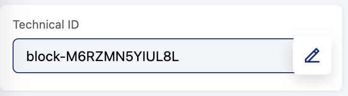
The technical ID is a unique identifier that identifies the corresponding field in the dataset created for your form's results.
In general, if you wish to change these IDs, we strongly recommend doing so before you publish and share your form, in order to avoid any discrepancies arising from results arriving before and after any change to an ID.
Most blocks offer two setting toggles:
Unique values: Toggle this to require that the value entered does not repeat any previously entered values.
Required: To make responding to this question or field obligatory.
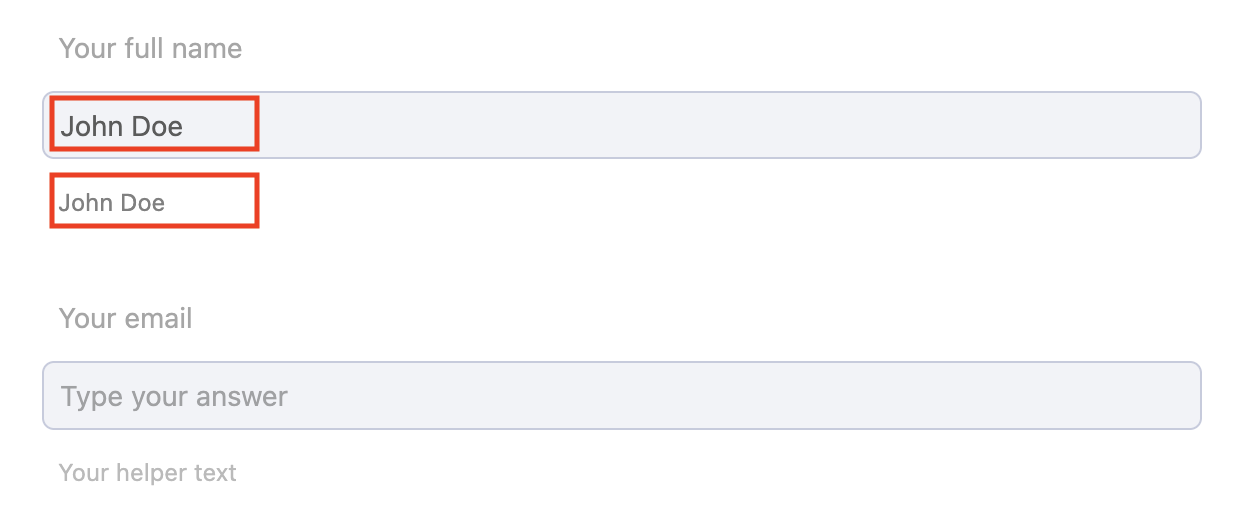
And in general, regarding blocks that require users to input text:
You can add placeholder text by typing directly into the input field (the first red box in the image below)
You can provide helper text (the second red box below)
Conditional logic
Your form can be made to adapt to user input by displaying new blocks only if they're relevant to that user.
For example, if your form allows users to report an issue, the questions on the form can be tailored to the kind of issue the user is reporting—for example, a technical issue compared to a billing problem.
To do this, you define the conditions under which each block will be hidden or displayed. To add a condition to a block, double click on the block you wish to edit and click on Add a condition.
The exact configuration options you're shown in the interface will depend on the type of input block and how constrained the user's answers are. A block where the user chooses from predefined values, or example, will have different options than a block where the user can freely enter their own responses.
But you will decide if the block is visible or not based on the user input, from among conditions such as:
is empty / is not empty
contains / does not contain
is / is not / is any of
equals / does not equal
is greater than / is greater than or equal to / is less than / is less than or equal to
is before / is before or on / is after / is after or on (a specificed date)
Note that "contains" and "does not contain" are case insensitive. In blocks with multiple possible responses, "is" or "is not" are inclusive—they require all of the designated responses to be present. If you want only one response to be enough, use "is any of."
The input blocks
Block | Description | Parameters |
Text | Enables input of short or long texts. | Length: 255 or 2000 characters |
Number | Allows numeric input. | Format: The default format is for a number, though you can change it to an integer or a decimal. |
Contact | Allows users to collect contact-related information such as email addresses and phone numbers. Highly customizable, it supports multiple fields and has format-specific settings. If the user is logged, some fields are filled with his account information. | Possible fields: Full name, first name, last name, email, organization, or phone number. For the phone numbers, you can choose an international format. International phone number are validated. For national phone numbers, the numbers are not verified, but the platform ensures that they contain only numbers. |
Choice | Offers users a multiple-choice question. | Format: Decide if the choices are presented as a list or as a dropdown menu with autocomplete suggestions. Values: Toggle to allow users to enter in the own value. Settings: "Multiple selection" allows users to select more than one option. You can specify the maximum number of selections allowed or set it to "Unlimited" for no restrictions. |
Advanced choice | Provides a dropdown menu with autosuggestions based on data from a dataset. | Data source: Select a dataset. Then select the field or fields you want included for each line in the autocomplete suggestions. Multiple fields will be separated by commas. |
Autofill | Like "Advanced choice," provides options based on a dataset, and the user's selection will autofill another form field with a related value. For example, you can imagine the user selecting a client, and seeing the clients address and contact information, which they can then confirm or update as needed. | Data source: Select a dataset. Then select the field or fields you want included for each line in the autocomplete suggestions. Multliple fields will be separated by commas. Target blocks: Designate the field from the data source that you want autofilled, and provide the technical ID of the field where you want it autofilled. |
True/False | Allows users to express binary responses via a toggle button. | |
Location picker | Allows users to select a geographic location or draw an area. | Type: Position, Geo points, Geoshape Basemap selection: Choose between the basemaps you have configured in your workspace. |
Location search (France) | Allows users to search for specific location details such as addresses, postcodes, and cities in France. It also supports autofilling additional location-related fields for improved efficiency. | Search input: Address: Full address input. Postcode: Search by postal code. City: Search by city name. INSEE code: Search by INSEE code. Add and autofill location details: City: Autofills the city based on the user's selection or their postal code. INSEE code: Autofills France's unique INSEE code for the selected location. |
Date & time | Allows the user to input dates, times, or time slots such as opening hours. | Fields: Request a date, a time, or a time slot. The time slot option proposes two dropdown menus, one for the day, and the other for one or two time slots, open 24/7, or closed. Time slots request the user choose the opening and closing hours for that slot. Format: For times or time slots, choose 12 or 24 hour clock. |
URL | Allows user to indicate a URL | |
Image | Allows users to upload an image | Source: "Computer," "URL," or "Either." For "computer," the user can upload files (max size 2 MB) from their computer. "URL" allows the user to enter a url. "Either" allows the user to choose between the two. |
Legal | Add consent to your form. This block is required by default when its used. | Legal fields: "Default" or "Custom." "Custom" allows you to fill the text in directly. "Dafault" values are for the privacy policy and terms and conditions as defined in your workspace's settings. |
Keywords | Captures a list of keywords. | Settings: "Unlimited," or else a "Maximum" number of keywords the user can provide, between 1 and 99. |
SIRET | Captures SIRET numbers (specific to French businesses). Note that we confirm that the number has a valid format but not that the number actually exists. | |
Linked datasets | Allows users to select datasets from the portal. |