 Getting started
 Exploring and using data
Exploring catalogs and datasets
Exploring a catalog of datasets
What's in a dataset
Filtering data within a dataset
An introduction to the Explore API
An introduction to the Automation API
Introduction to the WFS API
Downloading a dataset
Creating advanced charts with the Charts tool
Overview of the Maps interface
Configure your map
Manage your maps
Reorder and group layers in a map
Creating multi-layer maps
Share your map
Navigating maps made with the Maps interface
Rename and save a map
Creating pages with the Code editor
How to limit who can see your visualizations
Archiving a page
Managing a page's security
Creating a page with the Code editor
Content pages: ideas, tips & resources
How to insert internal links on a page or create a table of contents
Sharing and embedding a content page
How to troubleshoot maps that are not loading correctly
Creating content with Studio
Creating content with Studio
Adding a page
Publishing a page
Editing the page layout
Configuring blocks
Previewing a page
Adding text
Adding a chart
Adding an image block to a Studio page
Adding a choropleth map block in Studio
Adding a points of interest map block in Studio
Adding a key performance indicator (KPI)
Configuring page information
Using filters to enhance your pages
Refining data
Managing page access
How to edit the url of a Studio page
Adding a map block in Studio
Visualizations
Managing saved visualizations
Configuring the calendar visualization
The basics of dataset visualizations
Configuring the images visualization
Configuring the custom view
Configuring the table visualization
Configuring the map visualization
Understanding automatic clustering in maps
Configuring the analyze visualization
 Publishing data
Publishing datasets
Creating a dataset
Creating a dataset from a local file
Creating a dataset with multiple files
Creating a dataset from a remote source (URL, API, FTP)
Creating a dataset using dedicated connectors
Creating a dataset with media files
Federating an Opendatasoft dataset
Publishing a dataset
Publishing data from a CSV file
Publishing data in JSON format
Supported file formats
Promote mobility data thanks to GTFS and other formats
Configuring datasets
Automated removal of records
Configuring dataset export
Checking dataset history
Configuring the tooltip
Dataset actions and statuses
Dataset limits
Defining a dataset schema
How Opendatasoft manages dates
How and where Opendatasoft handles timezones
How to find your workspace's IP address
Keeping data up to date
Processing data
Translating a dataset
How to configure an HTTP connection to the France Travail API
Deciding what license is best for your dataset
Types of source files
OpenStreetMap files
Shapefiles
JSON files
XML files
Spreadsheet files
RDF files
CSV files
MapInfo files
GeoJSON files
KML/KMZ files
GeoPackage
Connectors
Saving and sharing connections
Airtable connector
Amazon S3 connector
ArcGIS connector
Azure Blob storage connector
Database connector
Dataset of datasets (workspace) connector
Eco Counter connector
Feed connector
Google BigQuery connector
Google Drive connector
How to find the Open Agenda API Key and the Open Agenda URL
JCDecaux connector
Netatmo connector
OpenAgenda connector
Realtime connector
Salesforce connector
SharePoint connector
U.S. Census connector
WFS connector
Databricks connector
Harvesters
Harvesting a catalog
ArcGIS harvester
ArcGIS Hub Portals harvester
CKAN harvester
CSW harvester
FTP with meta CSV harvester
Opendatasoft Federation harvester
Quandl harvester
Socrata harvester
data.gouv.fr harvester
data.json harvester
Processors
What is a processor and how to use one
Add a field processor
Compute geo distance processor
Concatenate text processor
Convert degrees processor
Copy a field processor
Correct geo shape processor
Create geo point processor
Decode HTML entities processor
Decode a Google polyline processor
Deduplicate multivalued fields processor
Delete record processor
Expand JSON array processor
Expand multivalued field processor
Expression processor
Extract HTML processor
Extract URLs processor
Extract bit range processor
Extract from JSON processor
Extract text processor
File processor
GeoHash to GeoJSON processor
GeoJoin processor
Geocode with ArcGIS processor
Geocode with BAN processor (France)
Geocode with PDOK processor
Geocode with the Census Bureau processor (United States)
Geomasking processor
Get coordinates from a three-word address processor
IP address to geo Coordinates processor
JSON array to multivalued processor
Join datasets processor
Meta expression processor
Nominatim geocoder processor
Normalize Projection Reference processor
Normalize URL processor
Normalize Unicode values processor
Normalize date processor
Polygon filtering processor
Replace text processor
Replace via regular expression processor
Retrieve Administrative Divisions processor
Set timezone processor
Simplify Geo Shape processor
Skip records processor
Split text processor
Transform boolean columns to multivalued field processor
Transpose columns to rows processor
WKT and WKB to GeoJson processor
what3words processor
Data Collection Form
About the Data Collection Form feature
Data Collection Forms associated with your Opendatasoft workspace
Create and manage your data collection forms
Sharing and moderating your data collection forms
Dataset metadata
![]() Analyzing how your data is used
Analyzing how your data is used
Getting involved: Sharing, Reusing and Reacting
Discovering & submitting data reuses
Sharing through social networks
Commenting via Disqus
Submitting feedback
Following dataset updates
Sharing and embedding data visualizations
Monitoring usage
An overview of monitoring your workspaces
Analyzing user activity
Analyzing actions
Detail about specific fields in the ods-api-monitoring dataset
How to count a dataset's downloads over a specific period
Analyzing data usage
Analyzing a single dataset with its monitoring dashboard
Analyzing back office activity
Using the data lineage feature
 Managing your users
Managing limits
Managing users
Managing users
Setting quotas for individual users
Managing access requests
Inviting users to the portal
Managing workspaces
 Managing your portal
Configuring your portal
Configure catalog and dataset pages
Configuring a shared catalog
Sharing, reusing, communicating
Customizing your workspace's URL
Managing legal information
Connect Google Analytics (GA4)
Regional settings
Pictograms reference
Managing tracking
Look & Feel
Branding your portal
Customizing portal themes
How to customize my portal according to the current language
Managing the dataset themes
Configuring data visualizations
Configuring the navigation
Adding IGN basemaps
Adding assets
Plans and quotas
Managing security
Configuring your portal's overall security policies
A dataset's Security tab
Mapping your directory to groups in Opendatasoft (with SSO)
Single sign-on with OpenID Connect
Single sign-on with SAML
Parameters
Creating multi-layer maps

Add a dataset to your map
- Inside the "My maps" interface, in the layer editing area, click on Add a dataset to this map.
- Choose the dataset you want to display on your map. You can select a dataset with geographical information either from your own catalog of datasets published on your domain or from the All available data catalog.
- Click on Select if you want to add all data or Filter data if you just want to add part of the data.

You can add as many datasets as you want on your map, and all of the data they contain can be displayed on that same map at the same time. This is when the whole concept of layers comes into play. In the Maps interface, because you overlay several datasets, each dataset is called a layer. This is why Maps allows you to configure your layers to make sure that you can represent many different data on the same map and still make the reading of this map easy and clear.
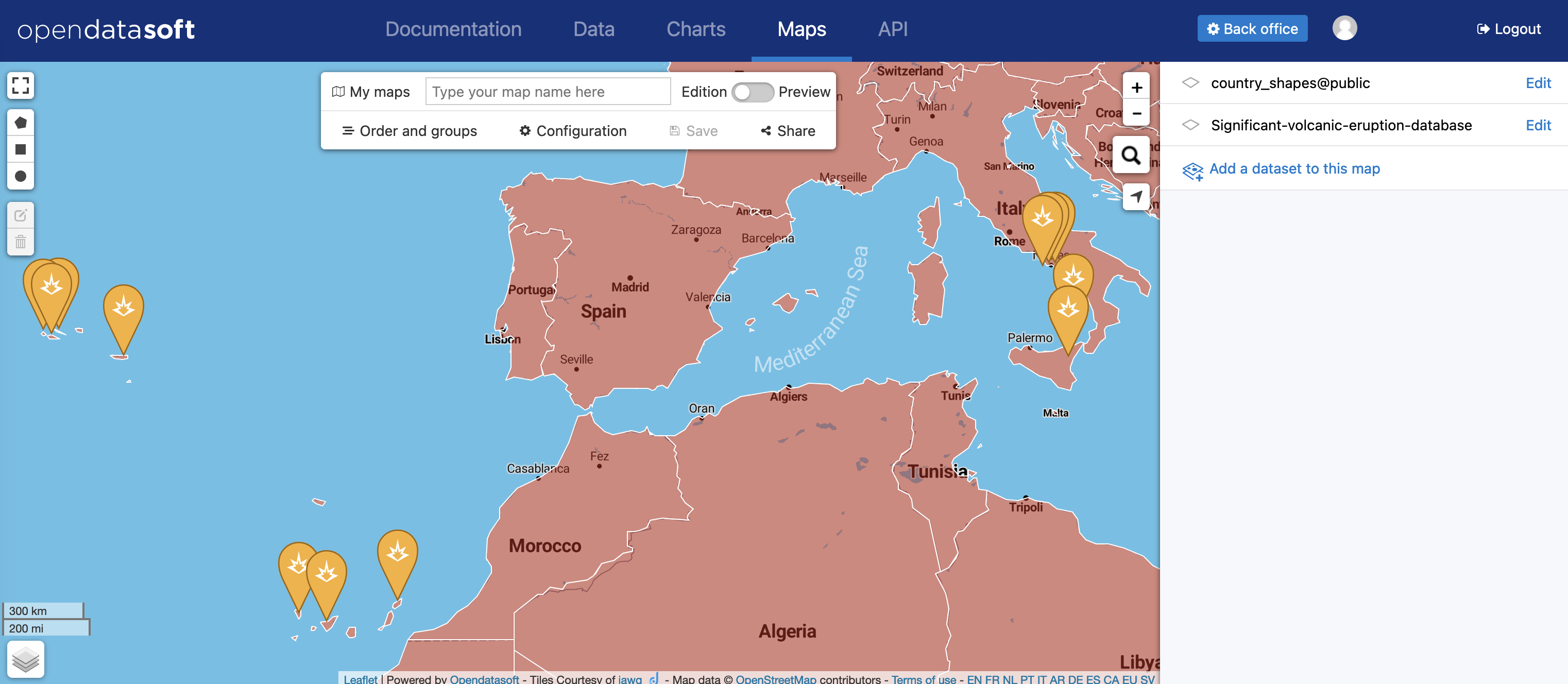
Edit a layer
Editing a layer (meaning, a dataset displayed on a map created with Maps) has two parts:
- Display: the style, in other words, how the data is displayed on the map
- Information: the information and caption that go with the dataset in order to better describe it

Edit style
- Click on the Display tab. The menu with all style configurations drops down.
- Choose a visualization mode and configure your layer as you like.
The style configurations entirely depend on the visualization mode you choose to apply to your layer. There are five different modes:
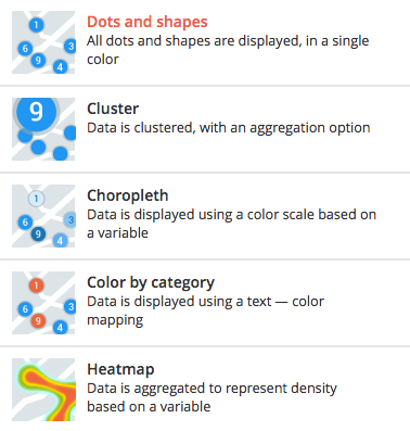
Dots and shapes
The Dots and shapes visualization mode simply displays your data as markers (dots or icons) or as shapes. It is the most common visualization mode.
Style configuration | Description |
Marker display What your data will look like on the map |
If you choose the Icon or the Map marker (with an optional icon) mode:
|
Shape styles Customize your markers and shapes |
For all the options above, simply drag the dot along the slider or directly change the numbers displayed on the right of each slider.
To change the color:
|
Shape borders Customize the border of your markers and shapes | Borders are only available for shapes and dots. Icons, and map markers do not have borders.
For the Pattern option, simply click on the provided menu and choose the one you want.
For the options above, simply drag the dot along the slider or directly change the numbers displayed on the right of each line.
To change the color:
|
Cluster
The cluster visualization mode groups your data into clusters instead of displaying them separately and individually. Clusters are grouped according to a chosen type of calculation: linear or logarithmic.
Style configuration | Description |
Cluster style What your cluster will look like on the map |
For all the options above, simply drag the dot along the slider or directly change the numbers displayed on the right of each slider.
To change the color:
|
Cluster border Customize the border of your clusters |
For the options above, simply drag the dot along the slider or directly change the numbers displayed on the right of each slider.
To change the color:
|
Aggregation operations Choose the base operation for your clusters | Choose, out of the available operations, which one you want your clusters to be based on. The result value will be displayed inside the cluster.
|
Computing Choose how the size of the clusters is calculated |
|
Choropleth
The choropleth visualization mode displays data as markers (dots or icons) or as shapes. It also enhances the visualization with colors. The markers and/or shapes are colored according to a color scheme, defined by a values range based on a chosen variable. The Choropleth mode allows the creation of a thematic layer.
Style configuration | Description |
Marker display What your data will look like on the map |
If you choose the Icon or the Map marker (with an optional icon) mode:
|
Shape styles Customize your dots and shapes |
For all the options above, simply drag the dot along the slider or directly change the numbers displayed on the right of each slider.
|
Shape borders Customize the border of your shapes | Borders are only available for dots and shapes. Icons and map markers do not have borders.
For the Pattern option, simply click on the provided menu and choose the one you want.
For the options above, simply drag the dot along the slider or directly change the numbers displayed on the right of each line.
To change the color:
|
Color by category
The Color by category visualization mode displays data as markers (dots or icons) or as shapes. It also enhances the visualization with colors. The markers and/or shapes are colored according to a color scheme based on defined categories - which can be numerical or not, just defined by a certain word. The Color by category mode allows the creation of a categorized layer.
Style configuration | Description |
Marker display What your data will look like on the map |
If you choose the Icon or the Map marker (with an optional icon) mode:
|
Shape styles Customize your dots and shapes |
For all the options above, simply drag the dot along the slider or directly change the numbers displayed on the right of each slider.
In that case, simply choose the right field, and the colors will automatically appear on the corresponding markers and/or dots of your map. |
Shape borders Customize the border of your markers and shapes | Borders are only available for dots and shapes. Icons and map markers do not have borders.
For the Pattern option, simply click on the provided menu and choose the one you want.
For the options above, simply drag the dot along the slider or directly change the numbers displayed on the right of each line.
To change the color:
|
Heatmap
The Heatmap visualization mode is not about markers or shapes. Instead, this mode groups data and displays them as a span of colors to show the differences of intensity of one variable but at different spots in the map.
Style configuration | Description |
Aggregation operations Choose on what operation your heatmap is based. | Choose, out of the available operations depending on your dataset, which one you want your heatmap to be based on.
|
Computing Choose how is calculated the progression of your heatmap |
|
Colors Choose the color palette of your heatmap |
|
Add and edit information
- Click the Information tab
Title and description

- Rename your layer in the Title area to make it clearer for the map viewers
- Add a Description in the provided area
Icon
You can add an icon to your layer, which will be displayed next to the layer’s title.
- Click on the Icon drop-down menu to choose the icon that represents your layer the best
- Click on the Color menu to add a color to the layer’s icon
Add and edit a caption
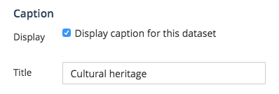
Captions are not mandatory. However, they are recommended because they add more information to your dataset, which means more clarity to the reading of your map.
- Click on the Caption tab
- If it’s not already the case, tick the Display caption for this dataset option
- In the provided area, write a Title for your layer’s caption
Delete a layer
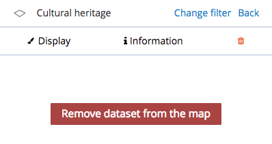
- Click on the delete icon
- Click on the red Remove dataset from the map button