 Getting started
 Exploring and using data
Exploring catalogs and datasets
Exploring a catalog of datasets
What's in a dataset
Filtering data within a dataset
An introduction to the Explore API
An introduction to the Automation API
Introduction to the WFS API
Downloading a dataset
Creating maps and charts
Creating advanced charts with the Charts tool
Overview of the Maps interface
Configure your map
Manage your maps
Reorder and group layers in a map
Creating multi-layer maps
Share your map
Navigating maps made with the Maps interface
Rename and save a map
Creating pages with the Code editor
How to limit who can see your visualizations
Archiving a page
Managing a page's security
Creating a page with the Code editor
Content pages: ideas, tips & resources
How to insert internal links on a page or create a table of contents
Sharing and embedding a content page
How to troubleshoot maps that are not loading correctly
Creating content with Studio
Creating content with Studio
Adding a page
Publishing a page
Editing the page layout
Configuring blocks
Previewing a page
Adding text
Adding a chart
Adding an image block to a Studio page
Adding a choropleth map block in Studio
Adding a points of interest map block in Studio
Adding a key performance indicator (KPI)
Configuring page information
Using filters to enhance your pages
Refining data
Managing page access
How to edit the url of a Studio page
Adding a map block in Studio
Visualizations
Managing saved visualizations
Configuring the calendar visualization
The basics of dataset visualizations
Configuring the images visualization
Configuring the custom view
Configuring the table visualization
Configuring the map visualization
Understanding automatic clustering in maps
Configuring the analyze visualization
 Publishing data
Publishing datasets
Creating a dataset
Creating a dataset from a local file
Creating a dataset with multiple files
Creating a dataset from a remote source (URL, API, FTP)
Creating a dataset using dedicated connectors
Creating a dataset with media files
Federating an Opendatasoft dataset
Publishing a dataset
Publishing data from a CSV file
Publishing data in JSON format
Supported file formats
Promote mobility data thanks to GTFS and other formats
Configuring datasets
Automated removal of records
Configuring dataset export
Checking dataset history
Configuring the tooltip
Dataset actions and statuses
Dataset limits
Defining a dataset schema
How Opendatasoft manages dates
How and where Opendatasoft handles timezones
How to find your workspace's IP address
Keeping data up to date
Processing data
Translating a dataset
How to configure an HTTP connection to the France Travail API
Deciding what license is best for your dataset
Types of source files
OpenStreetMap files
Shapefiles
JSON files
XML files
Spreadsheet files
RDF files
CSV files
MapInfo files
GeoJSON files
KML/KMZ files
GeoPackage
Connectors
Saving and sharing connections
Airtable connector
Amazon S3 connector
ArcGIS connector
Azure Blob storage connector
Database connector
Dataset of datasets (workspace) connector
Eco Counter connector
Feed connector
Google BigQuery connector
Google Drive connector
How to find the Open Agenda API Key and the Open Agenda URL
JCDecaux connector
Netatmo connector
OpenAgenda connector
Realtime connector
Salesforce connector
SharePoint connector
U.S. Census connector
WFS connector
Databricks connector
Harvesters
Harvesting a catalog
ArcGIS harvester
ArcGIS Hub Portals harvester
CKAN harvester
CSW harvester
FTP with meta CSV harvester
Opendatasoft Federation harvester
Quandl harvester
Socrata harvester
data.gouv.fr harvester
data.json harvester
Processors
What is a processor and how to use one
Add a field processor
Compute geo distance processor
Concatenate text processor
Convert degrees processor
Copy a field processor
Correct geo shape processor
Create geo point processor
Decode HTML entities processor
Decode a Google polyline processor
Deduplicate multivalued fields processor
Delete record processor
Expand JSON array processor
Expand multivalued field processor
Expression processor
Extract HTML processor
Extract URLs processor
Extract bit range processor
Extract from JSON processor
Extract text processor
File processor
GeoHash to GeoJSON processor
GeoJoin processor
Geocode with ArcGIS processor
Geocode with BAN processor (France)
Geocode with PDOK processor
Geocode with the Census Bureau processor (United States)
Geomasking processor
Get coordinates from a three-word address processor
IP address to geo Coordinates processor
JSON array to multivalued processor
Join datasets processor
Meta expression processor
Nominatim geocoder processor
Normalize Projection Reference processor
Normalize URL processor
Normalize Unicode values processor
Normalize date processor
Polygon filtering processor
Replace text processor
Replace via regular expression processor
Retrieve Administrative Divisions processor
Set timezone processor
Simplify Geo Shape processor
Skip records processor
Split text processor
Transform boolean columns to multivalued field processor
Transpose columns to rows processor
WKT and WKB to GeoJson processor
what3words processor
Data Collection Form
About the Data Collection Form feature
Data Collection Forms associated with your Opendatasoft workspace
Create and manage your data collection forms
Sharing and moderating your data collection forms
Dataset metadata
 Analyzing how your data is used
Getting involved: Sharing, Reusing and Reacting
Discovering & submitting data reuses
Sharing through social networks
Commenting via Disqus
Submitting feedback
Following dataset updates
Sharing and embedding data visualizations
Monitoring usage
An overview of monitoring your workspaces
Analyzing user activity
Analyzing actions
Detail about specific fields in the ods-api-monitoring dataset
How to count a dataset's downloads over a specific period
Analyzing data usage
Analyzing a single dataset with its monitoring dashboard
Analyzing back office activity
Using the data lineage feature
 Managing your users
Managing limits
Managing users
Managing users
Setting quotas for individual users
Managing access requests
Inviting users to the portal
Managing workspaces
 Managing your portal
Configuring your portal
Configure catalog and dataset pages
Configuring a shared catalog
Sharing, reusing, communicating
Customizing your workspace's URL
Managing legal information
Connect Google Analytics (GA4)
Regional settings
Pictograms reference
Managing tracking
Branding your portal
Customizing portal themes
How to customize my portal according to the current language
Managing the dataset themes
Configuring data visualizations
Configuring the navigation
Adding IGN basemaps
Adding assets
Plans and quotas
Managing security
Configuring your portal's overall security policies
A dataset's Security tab
Mapping your directory to groups in Opendatasoft (with SSO)
Single sign-on with OpenID Connect
Single sign-on with SAML
Parameters
Customizing portal themes

The default theme of all Opendatasoft portals can be entirely customized, not only in terms of layout and colors but also regarding specific areas such as header, footer, and catalog cards. Theme configurations and managed from the Look & feel > Theme subsection of the back office.
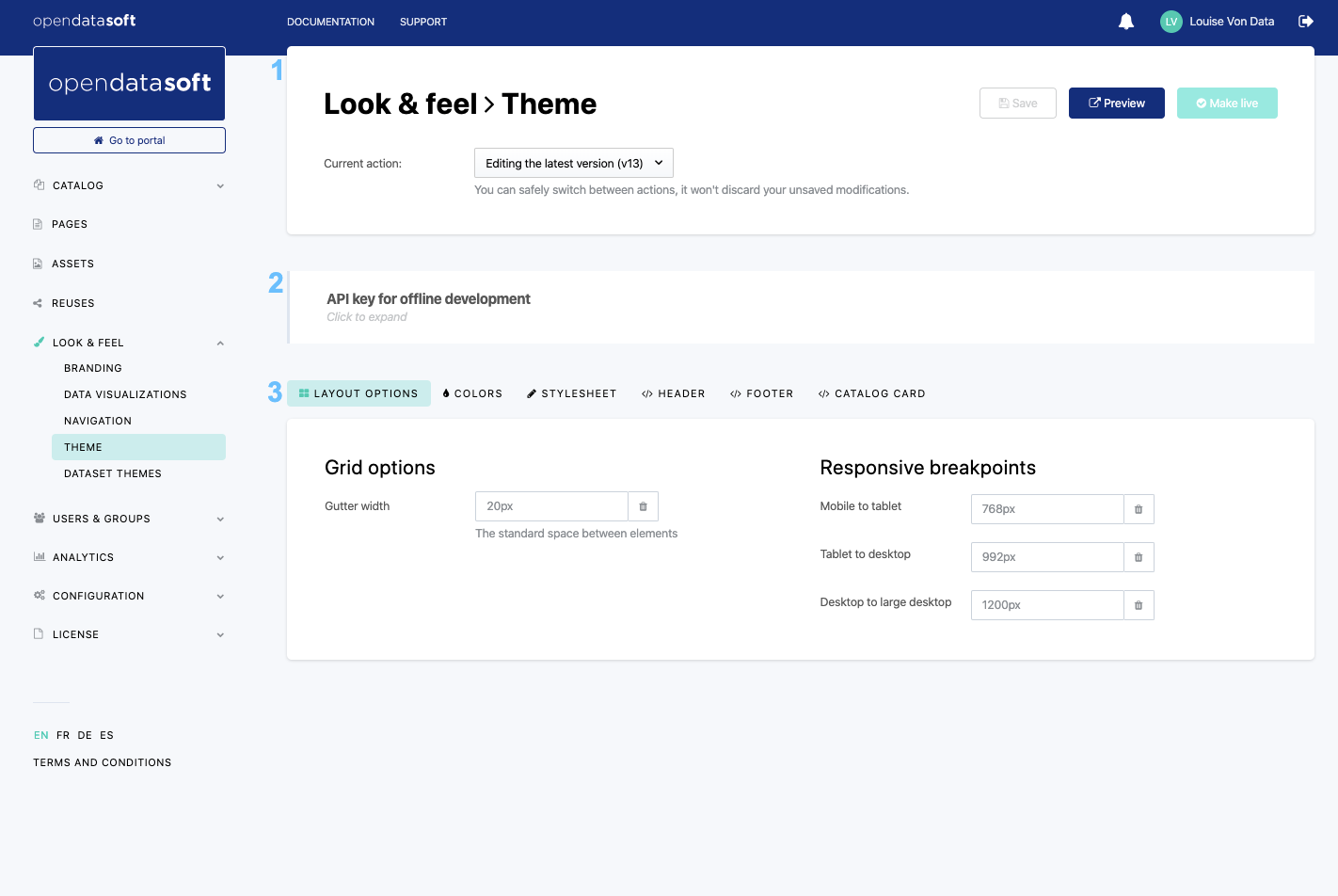
The Theme interface comprises 3 main blocks.
- The header (1) which displays not only the title of the interface but also a Current action drop-down menu to manage versioning (see Versioning themes below). Three important buttons are also displayed in the header:
1. Save, to save the new configurations
2. Preview, to open in a new tab the Opendatasoft portal with the newly applied configurations
3. Make live, to define the newly applied configurations as the new, live theme available on the Opendatasoft portal - The API key for offline development management block (2), which allows the use and generation of new API keys (see note right below for more information).
To find and use a theme API key, click on the API key for offline development block to expand it. The current API key is displayed in the block, ready to be copied and used.
It is also possible to generate a new API key by clicking on the Generate new key button. However, be careful when generating new API keys: only the current one can be used, which means that generating a new API key revokes all previous ones.
- A block of 6 tabs (3), each one allowing to configure a part of an Opendatasoft portal theme (see Customizing a portal theme below):
- Layout options, to modify the general layout of the portal
- Colors, to change colors of backgrounds, texts, borders, links, etc.
- Stylesheet, to add more style to the portal with CSS
- Header, to modify the header with HTML code
- Footer, to modify the footer with HTML code
- Catalog card, to modify the catalog cards with HTML code
Versioning themes

Portal themes are versioned, which means that each customized new theme has a version number assigned to it. Once a theme is finished and made live, another version is automatically created: it is the new draft theme on which to work until it is ready to be live.
The Current action drop-down menu displayed in the header indicates which version one is currently working on. It also allows to select previous themes that were already made live.
While working on the latest draft version of the portal theme, it is possible to preview what the portal will look like with this new theme. A Preview button is indeed displayed between the Make live and Save buttons to open a new tab with the portal configured with the draft theme.
Customizing a portal theme
Layout options
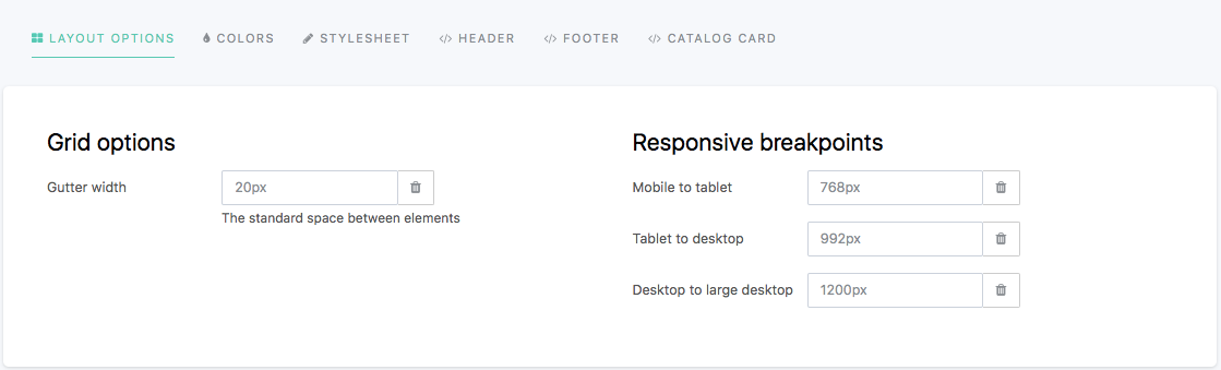
The Layout options tab allows to customize the portal layout, which by default relies on a 12-columns grid system inherited from the Bootstrap CSS framework.
More specifically, in this tab, it is possible to modify:
- the Gutter width, which is the space (in pixels) between the various elements that compose an interface of the portal (columns, rows, and boxes), and
- the Responsive breakpoints, which are the various screen widths (in pixels) at which the layout should change to adapt to the available space (for example, the portal layout should differ depending on whether it is used from a mobile phone or a desktop because the screen of a mobile phone is much smaller than that of a desktop). A web interface that adapts depending on the screen width is indeed called "responsive". There are 3 configurable breakpoints between 4 standard screen size associated with common devices:
- Mobile to tablet: to go from an extra-small screen to a small screen
- Tablet to desktop: to go from a small screen to a medium screen
- Desktop to large desktop: to go from a medium screen to a large screen
To modify a layout option:
- Write a new width, in pixels, in the chosen textbox.
- Click on the Save button in the top right corner.
To reset any layout option to its default value, click on the trash button.
Colors
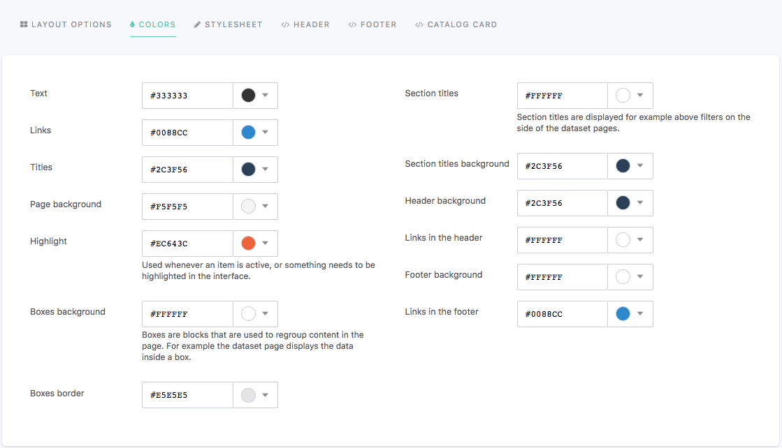
The Colors tab allows to customize the colors used in the texts and links, backgrounds, and borders of the portal.
The color of the following elements of an Opendatasoft portal can be configured in this tab:
Category | Configurable elements |
Text |
|
Background |
|
Borders |
|
To modify a theme color:
- In the chosen textbox, write the hexadecimal code of the new color, or click the color button to choose a new color using either the Nice colors or the Color wheel.
- Click on the Save button in the top right corner.
To reset to the color of the currently live portal theme, click on the Reset button.
var(--variable-name)The available variables are:
text, links, titles, page-background, highlight, boxes-background, boxes-border, section-titles, section-titles-background, header-background, header-links, footer-background and footer-links.These CSS variables are compatible with all browsers because the Opendatasoft platform automatically replaces all variables with their real theme color values.
Stylesheet
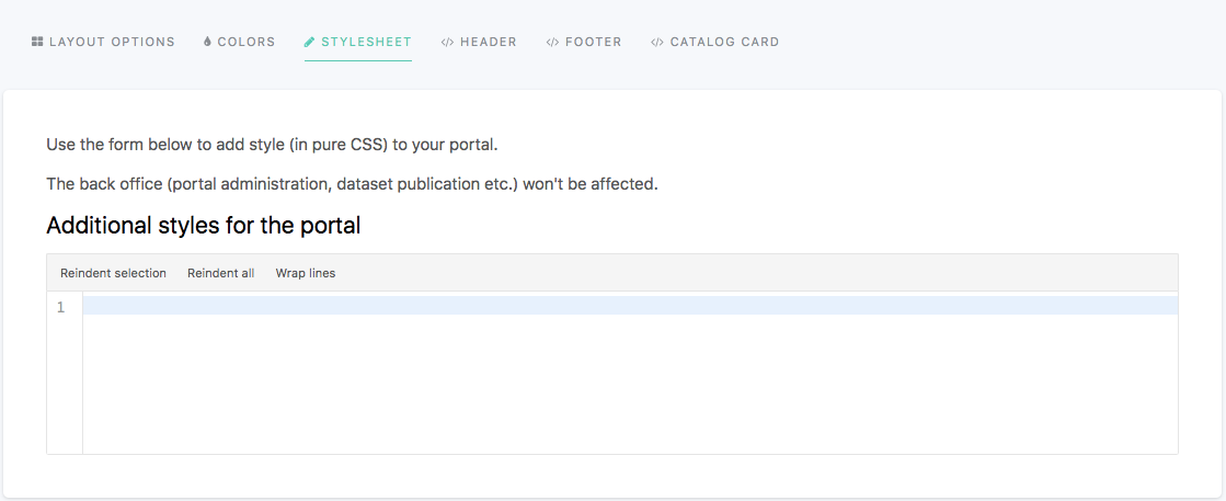
The Stylesheet tab displays an editor in which to add pure CSS style rules. It allows the push even further the customization of a portal theme. All rules added in this tab will have precedence over the configurations defined in the other theme tabs.
To change the style of an element, find the element's class and change the desired CSS property. Class names are written as block, element, modifier: .ods-block[--blockmodifier][__element][--elementmodifier].
Header and Footer
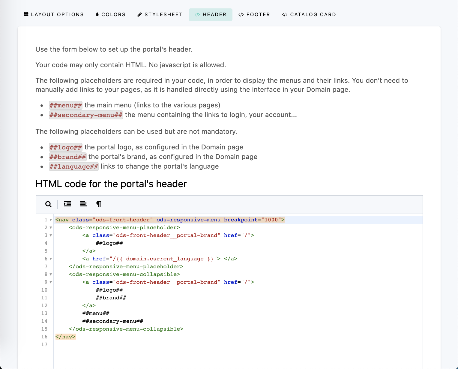
The Header and Footer tabs each display an editor in which to add pure HTML. Although both the header and the footer can be partially customized via the Colors tab, these tabs allow to push even further the customization of these areas of the portal.
Both the header and the footer are wrapped within independent AngularJS applications, which means that standard Angular directives such as ng-if, ng-class, ng-show, and ng-hide can be used.
ods-responsive-menu directive.Placeholders can also be used when customizing the header and the footer: they will be replaced with the content specified in the domain customization options such as menu items, language selectors, and logos.
The following placeholders are available in the Header tab:
Placeholder | Information |
| Main menu, with links to chosen pages |
| Menu containing links to login page and user account |
| Portal logo configured in Branding |
| Portal brand configured in Branding |
| Links to change the language of the portal |
The following placeholders are available in the Footer tab:
Placeholder | Information |
| Link to the Terms & Conditions defined for the portal, configured in Legals |
| Link for users to modify their cookies preferences. This placeholder is mandatory to enable the cookie banner. For more information, see Managing legal information. |
| Language picker for the languages specified for the portal |
| Opendatasoft logo |
Catalog card
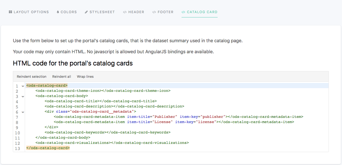
The Catalog card tab displays an editor in which to add pure HTML. It allows to customize the catalog cards displayed in the catalog of the portal, which represent the published datasets of that portal (see Exploring a dataset from the catalog).
The following directives allow to retrieve information related to a dataset, which could be included in the catalog card.
Directive | Information | ||||||||||||||||||||||||||
| Mandatory. Wraps the whole catalog card for the other directives to work | ||||||||||||||||||||||||||
| Retrieves the dataset's theme and includes the related icon | ||||||||||||||||||||||||||
| Provides useful style and behavior handling edge cases (for example, datasets without records) | ||||||||||||||||||||||||||
| Retrieves the title of the dataset | ||||||||||||||||||||||||||
| Retrieves the description of the dataset | ||||||||||||||||||||||||||
| Retrieves the keywords defined for the dataset | ||||||||||||||||||||||||||
| Takes an Example: The table below lists all available metadata item keys:
|