 Getting started
 Exploring and using data
Exploring catalogs and datasets
Exploring a catalog of datasets
What's in a dataset
Filtering data within a dataset
An introduction to the Explore API
An introduction to the Automation API
Introduction to the WFS API
Downloading a dataset
Search your data with AI (vector search)
Creating advanced charts with the Charts tool
Overview of the Maps interface
Configure your map
Manage your maps
Reorder and group layers in a map
Creating multi-layer maps
Share your map
Navigating maps made with the Maps interface
Rename and save a map
Creating pages with the Code editor
How to limit who can see your visualizations
Archiving a page
Managing a page's security
Creating a page with the Code editor
Content pages: ideas, tips & resources
How to insert internal links on a page or create a table of contents
Sharing and embedding a content page
How to troubleshoot maps that are not loading correctly
Creating content with Studio
Creating content with Studio
Adding a page
Publishing a page
Editing the page layout
Configuring blocks
Previewing a page
Adding text
Adding a chart
Adding an image block to a Studio page
Adding a map block in Studio
Adding a choropleth map block in Studio
Adding a points of interest map block in Studio
Adding a key performance indicator (KPI)
Configuring page information
Using filters to enhance your pages
Refining data
Managing page access
How to edit the url of a Studio page
Embedding a Studio page in a CMS
Visualizations
Managing saved visualizations
Configuring the calendar visualization
The basics of dataset visualizations
Configuring the images visualization
Configuring the custom view
Configuring the table visualization
Configuring the map visualization
Understanding automatic clustering in maps
Configuring the analyze visualization
 Publishing data
Publishing datasets
Creating a dataset
Creating a dataset from a local file
Creating a dataset with multiple files
Creating a dataset from a remote source (URL, API, FTP)
Creating a dataset using dedicated connectors
Creating a dataset with media files
Federating an Opendatasoft dataset
Publishing a dataset
Publishing data from a CSV file
Publishing data in JSON format
Supported file formats
Promote mobility data thanks to GTFS and other formats
What is updated when publishing a remote file?
Configuring datasets
Automated removal of records
Configuring dataset export
Checking dataset history
Configuring the tooltip
Dataset actions and statuses
Dataset limits
Defining a dataset schema
How Opendatasoft manages dates
How and where Opendatasoft handles timezones
How to find your workspace's IP address
Keeping data up to date
Processing data
Translating a dataset
How to configure an HTTP connection to the France Travail API
Deciding what license is best for your dataset
Types of source files
OpenStreetMap files
Shapefiles
JSON files
XML files
Spreadsheet files
RDF files
CSV files
MapInfo files
GeoJSON files
KML/KMZ files
GeoPackage
Connectors
Saving and sharing connections
Airtable connector
Amazon S3 connector
ArcGIS connector
Azure Blob storage connector
Database connectors
Dataset of datasets (workspace) connector
Eco Counter connector
Feed connector
Google BigQuery connector
Google Drive connector
How to find the Open Agenda API Key and the Open Agenda URL
JCDecaux connector
Netatmo connector
OpenAgenda connector
Realtime connector
Salesforce connector
SharePoint connector
U.S. Census connector
WFS connector
Databricks connector
Connecteur Waze
Harvesters
Harvesting a catalog
ArcGIS harvester
ArcGIS Hub Portals harvester
CKAN harvester
CSW harvester
FTP with meta CSV harvester
Opendatasoft Federation harvester
Quandl harvester
Socrata harvester
data.gouv.fr harvester
data.json harvester
Processors
What is a processor and how to use one
Add a field processor
Compute geo distance processor
Concatenate text processor
Convert degrees processor
Copy a field processor
Correct geo shape processor
Create geo point processor
Decode HTML entities processor
Decode a Google polyline processor
Deduplicate multivalued fields processor
Delete record processor
Expand JSON array processor
Expand multivalued field processor
Expression processor
Extract HTML processor
Extract URLs processor
Extract bit range processor
Extract from JSON processor
Extract text processor
File processor
GeoHash to GeoJSON processor
GeoJoin processor
Geocode with ArcGIS processor
Geocode with BAN processor (France)
Geocode with PDOK processor
Geocode with the Census Bureau processor (United States)
Geomasking processor
Get coordinates from a three-word address processor
IP address to geo Coordinates processor
JSON array to multivalued processor
Join datasets processor
Meta expression processor
Nominatim geocoder processor
Normalize Projection Reference processor
Normalize URL processor
Normalize Unicode values processor
Normalize date processor
Polygon filtering processor
Replace text processor
Replace via regular expression processor
Retrieve Administrative Divisions processor
Set timezone processor
Simplify Geo Shape processor
Skip records processor
Split text processor
Transform boolean columns to multivalued field processor
Transpose columns to rows processor
WKT and WKB to GeoJson processor
what3words processor
Data Collection Form
About the Data Collection Form feature
Data Collection Forms associated with your Opendatasoft workspace
Create and manage your data collection forms
Sharing and moderating your data collection forms
Dataset metadata
![]() Analyzing how your data is used
Analyzing how your data is used
Getting involved: Sharing, Reusing and Reacting
Discovering & submitting data reuses
Sharing through social networks
Commenting via Disqus
Submitting feedback
Following dataset updates
Sharing and embedding data visualizations
Monitoring usage
An overview of monitoring your workspaces
Analyzing user activity
Analyzing actions
Detail about specific fields in the ods-api-monitoring dataset
How to count a dataset's downloads over a specific period
Analyzing data usage
Analyzing a single dataset with its monitoring dashboard
Analyzing back office activity
Using the data lineage feature
 Managing your users
Managing limits
Managing users
Managing users
Setting quotas for individual users
Managing access requests
Inviting users to the portal
Managing workspaces
 Managing your portal
Configuring your portal
Configure catalog and dataset pages
Configuring a shared catalog
Sharing, reusing, communicating
Customizing your workspace's URL
Managing legal information
Connect Google Analytics (GA4)
Regional settings
Pictograms reference
Managing tracking
Look & Feel
Branding your portal
Customizing portal themes
How to customize my portal according to the current language
Managing the dataset themes
Configuring data visualizations
Configuring the navigation
Adding IGN basemaps
Adding assets
Plans and quotas
Managing security
Configuring your portal's overall security policies
A dataset's Security tab
Mapping your directory to groups in Opendatasoft (with SSO)
Single sign-on with OpenID Connect
Single sign-on with SAML
Parameters
Creating advanced charts with the Charts tool

The Charts tool allows you to visualize multiple datasets on a single, customized chart. Charts is more flexible than the Analyze tab, since you're not limited to one dataset. You can combine different sources from your domain and the entire Opendatasoft network. Then, after you create and save a chart, you can share it, embed it, or use it as a widget.
To use Charts, go to any ODS portal and find it through the portal's navigation (on your own portal this is the Charts tab at the top of the page). Otherwise, you can type /chart at the end of any portal's URL.
Your first layer
Click on Add a dataset to this layer to start importing data to your chart.
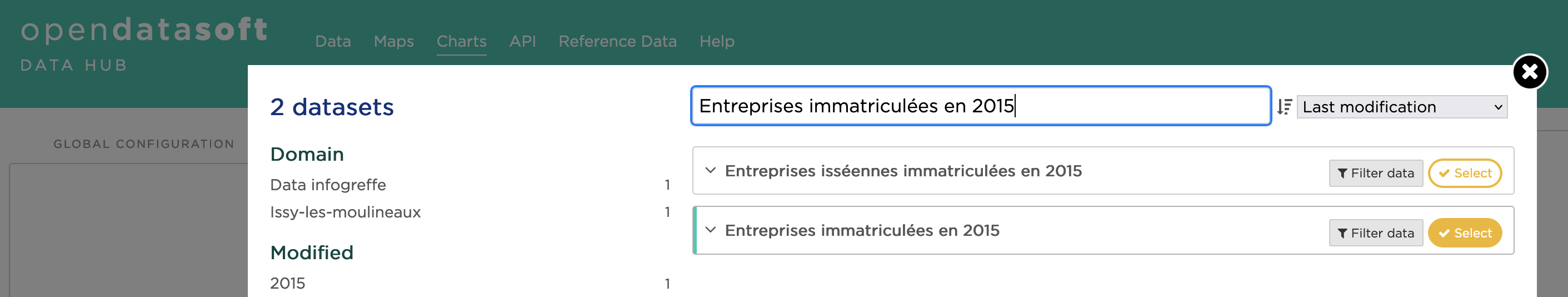
The list of available datasets is displayed. You can search or browse by category to find the dataset that interests you, then preview and filter it before importing it.
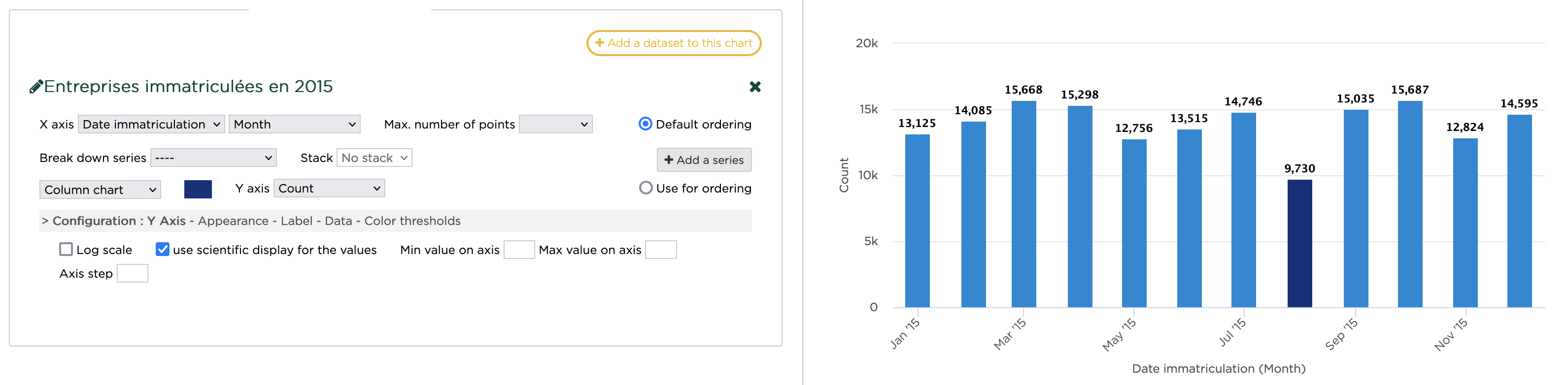
As an example, let's take the public dataset "Entreprises immatriculées en 2015" from the Data Infogreffe domain. You could click Filter data to refine the data, but in our case let's select the dataset.
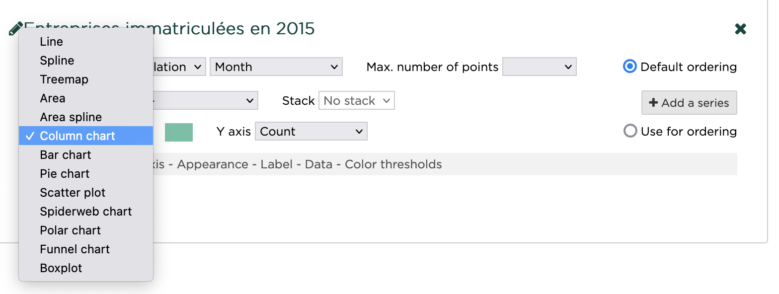
In the configuration, you can choose the appropriate type of graph. Select Column chart.
By default, Y-axis is set to Count. Next to this selection menu, you click on the color box to pick another color for the columns.
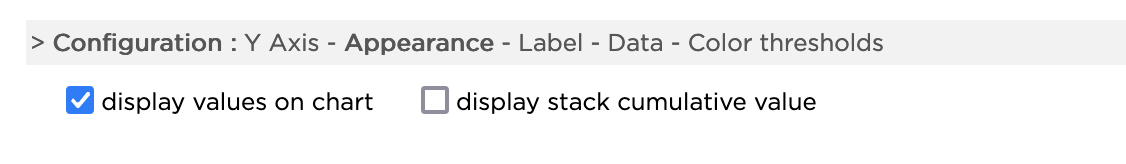
In the configuration settings, click on Appearance, then display values on chart. This adds a label with a numerical value on top of each column. Under Y-Axis, you can set the scientific display for the Y scale.
Finally, click on Color thresholds and add a threshold. You can add multiple thresholds with different colors, but here is what this layer looks like with a threshold for all values above 10,000.
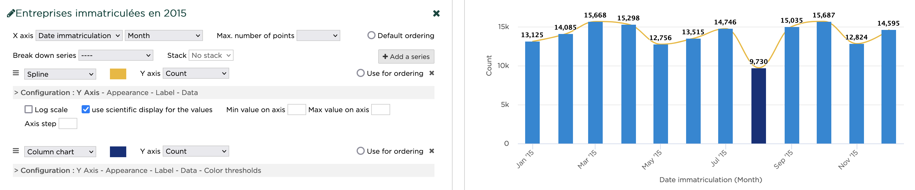
Adding a series
You can add a data representation on the same dataset by clicking on Add a series and adding the same dataset.
The X-Axis parameters will be the same, but you can customize the type of chart and tweak the appearance on the new series.
Try changing the type from Line to Spline to see a smooth line on top of the initial column chart.
You can reorder the series by clicking and dragging on the icon to the left of the chart type. The series order affects the chart legend, and the series at the top has priority on the Y-Axis parameter.
Creating a chart with multiple layers
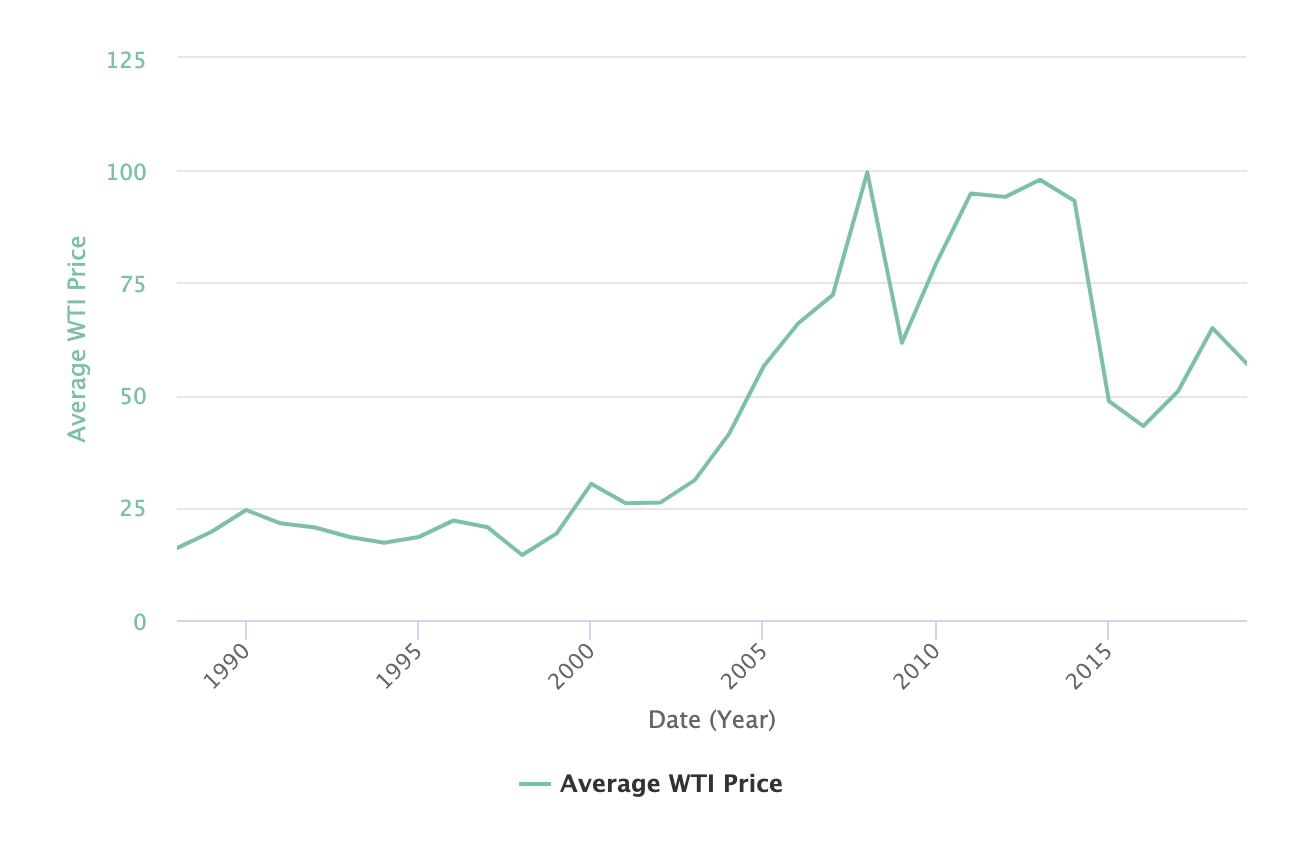
You can create data visualizations with multiple, different layers. Such visualizations can help you find trends in data.
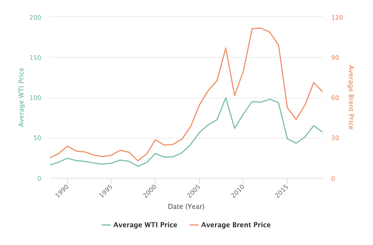
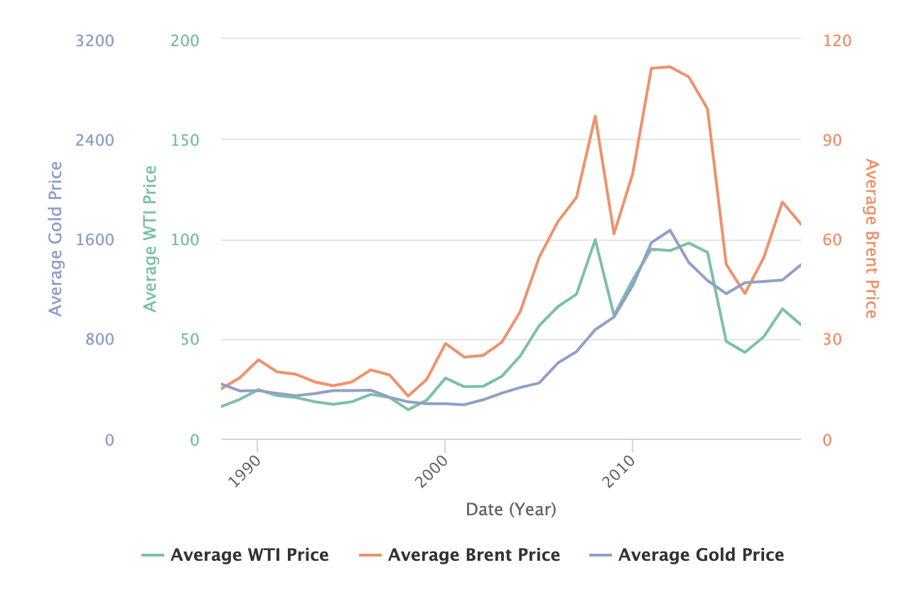
For example, you can create a data visualization to find whether oil prices are correlated with gold prices. This example relies on the monthly prices of Brent and West Texas Intermediate (WTI) oil from 1988 to 2019, and the monthly price of gold from 1988 to 2019 as reported by the Deutsche Bundesbank.
Step 1: Add your first layer
- Go to Charts
- Click on Add a dataset to this layer
- Search for "oil prices" and select the "oil prices" dataset
A line has been added to the chart.
Step 2: Add a series
Add another series to show Brent prices:
- Click on Add a series
- On the line that appears, change WTI Price to Brent Price and leave the other parameters unchanged.
A second line has been added to the chart.
Step 3: Add another layer
Add the gold price dataset to see whether there is a correlation between oil prices and gold prices:
- Click on Add a dataset to this layer
- Search for "gold prices" and select that dataset
The default visualization is a line with the average gold price.
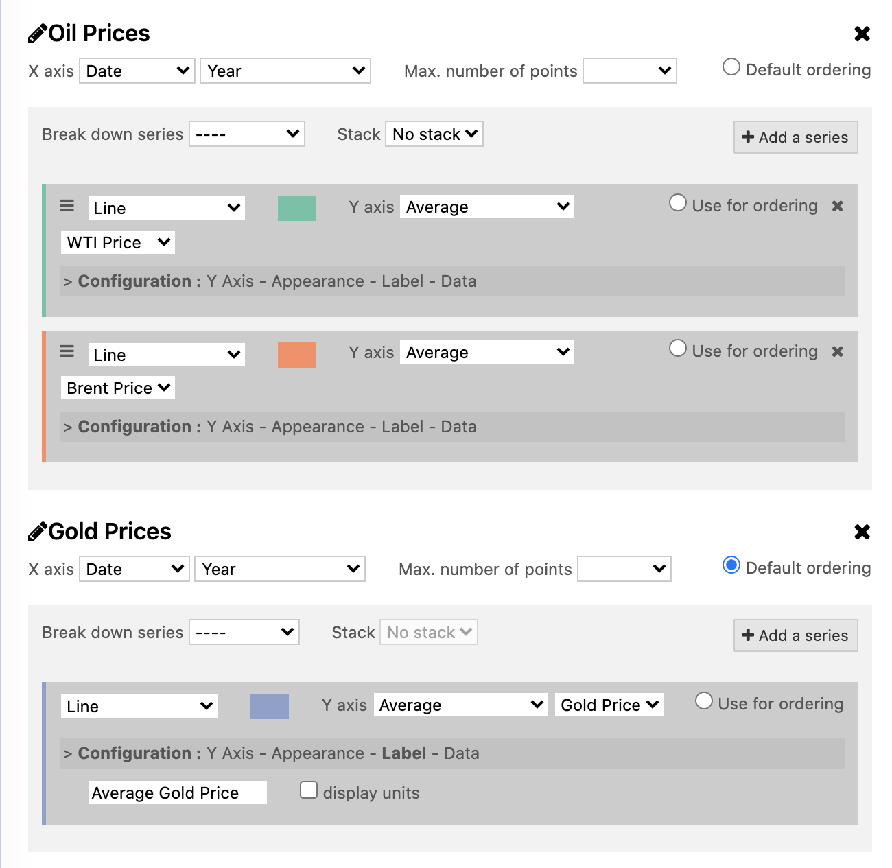
You can click on the pencil icon of a layer to change the selected dataset or refine the query.
- On the gold price layer, click Configuration > Label
- Enter "Average Gold Price" in the Alternate series title field
Step 4: Finalize the chart configuration
Add a title to the chart.
- Enter a name for this chart in the Chart title field.
Here is the final configuration:
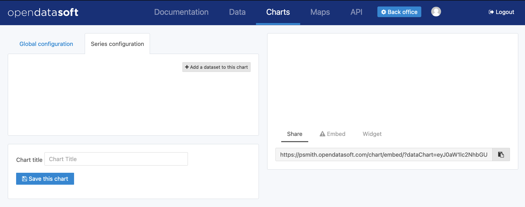
- Click on the Save this chart button to create a short URL that you can embed or share.
Here is the final result of the chart:
Other examples of charts
Column chart
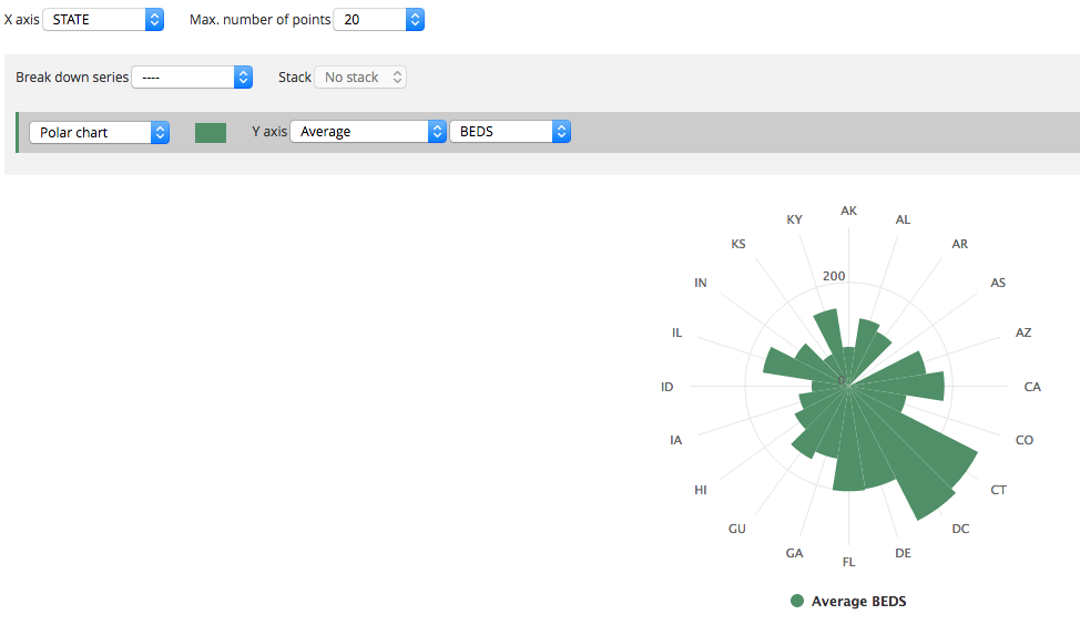
Polar chart